

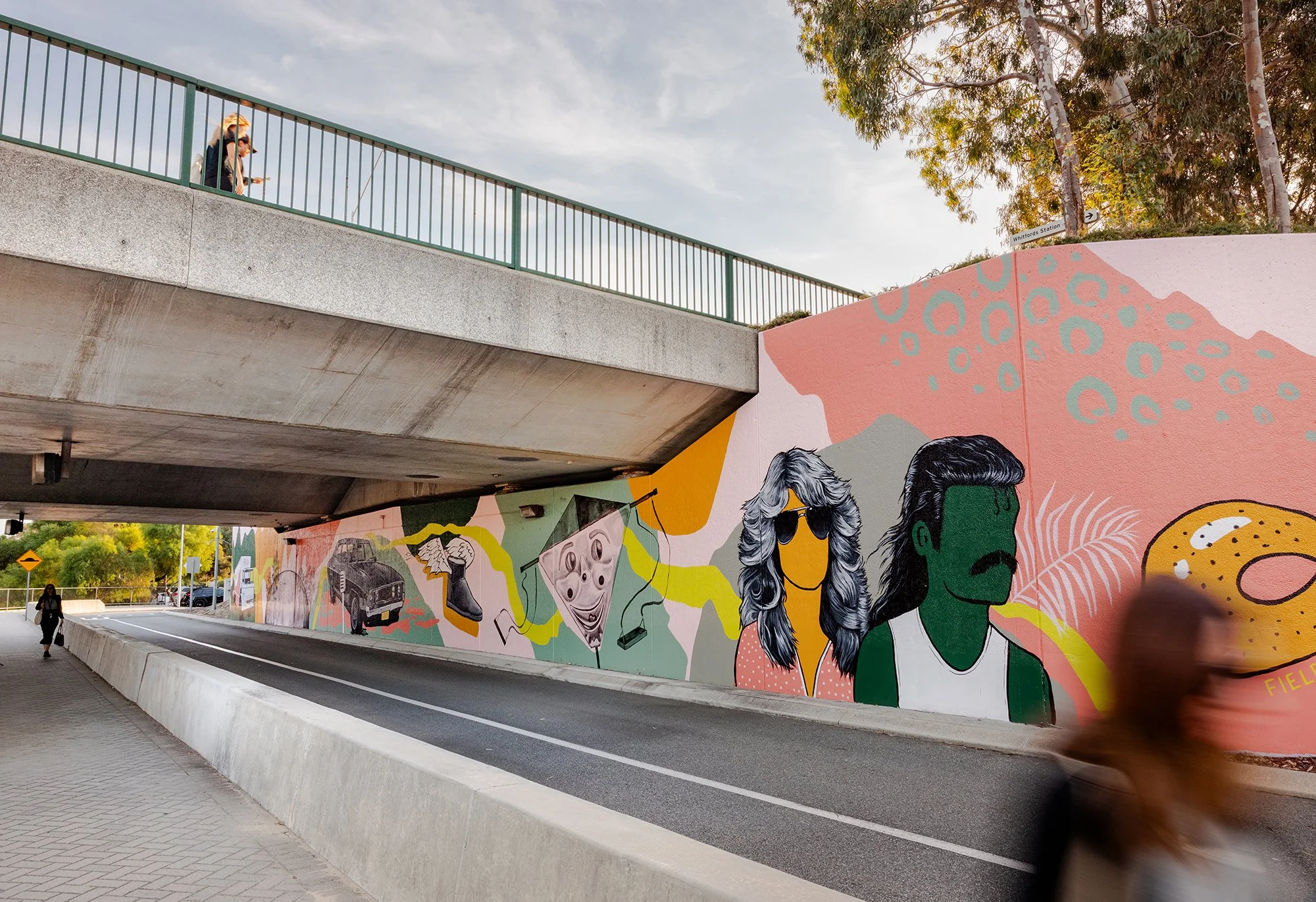
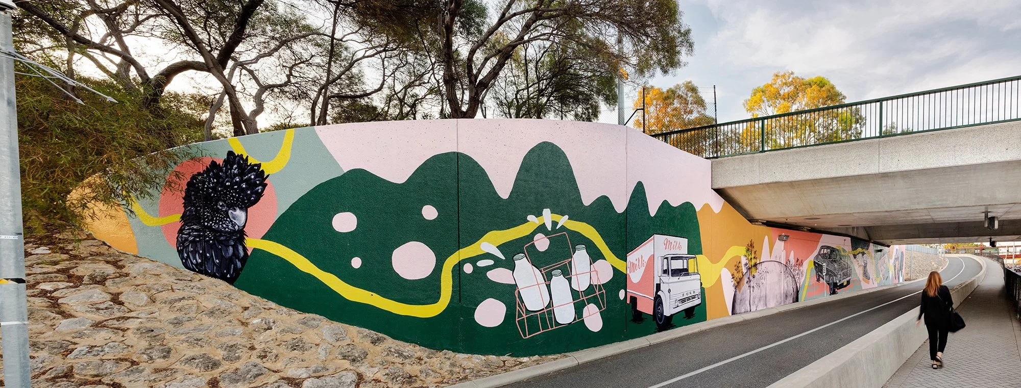
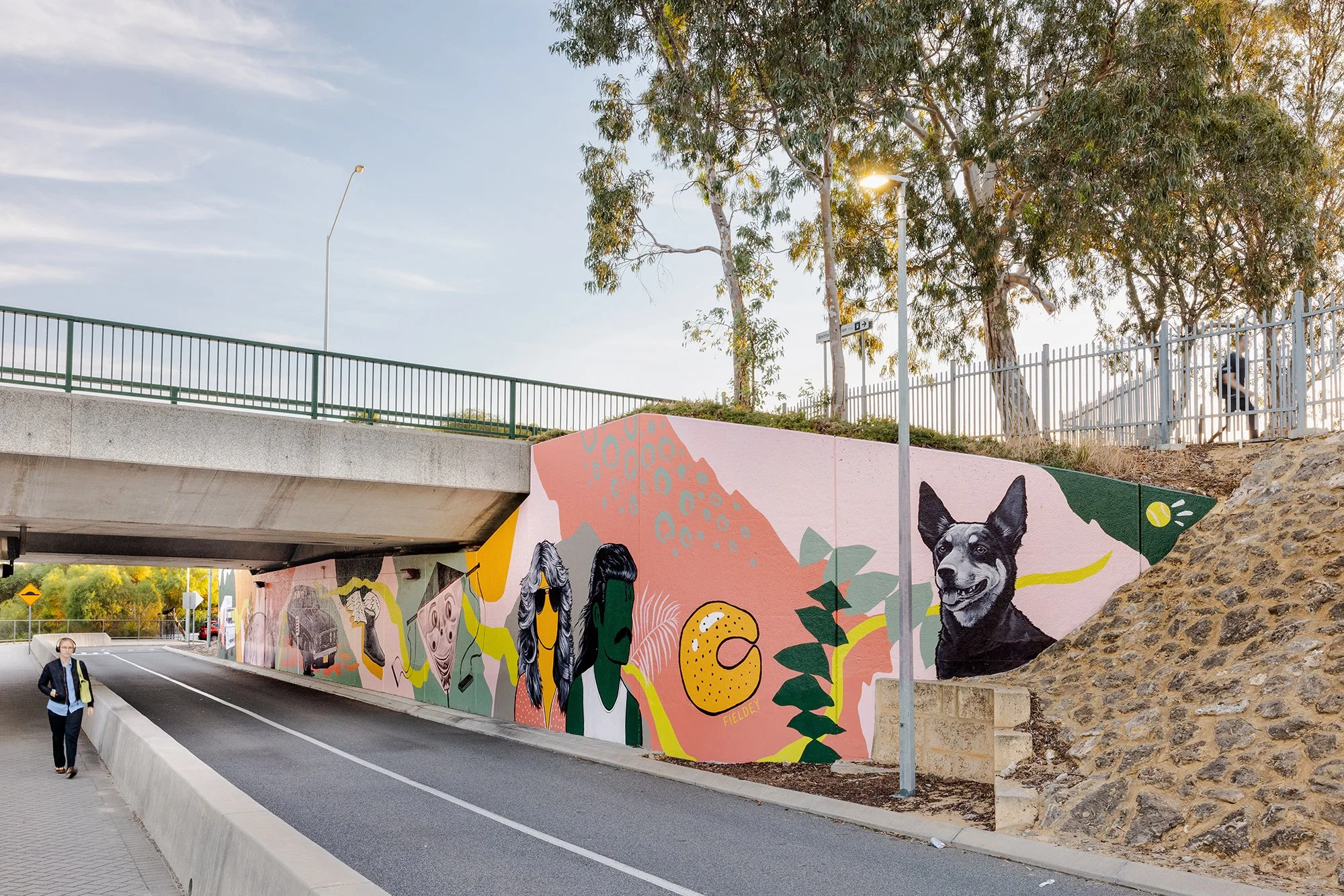
Retro Roots & Suburban Boots
Fieldey’s newest mural, Retro Roots & Suburban Boots, is a love letter to the working-class charm of Perth’s northern suburbs from the 1970s through to the 1990s. With Retro Roots & Suburban Boots, Fieldey offers a vibrant, layered response to place—celebrating the working-class identity and rich suburban culture of Perth’s northern suburbs from the 1970s through to the 1990s. Situated in Craigie, where the artist first settled after moving to Perth, the mural interweaves personal narrative with community-sourced memories to tell a collective story of time and belonging.
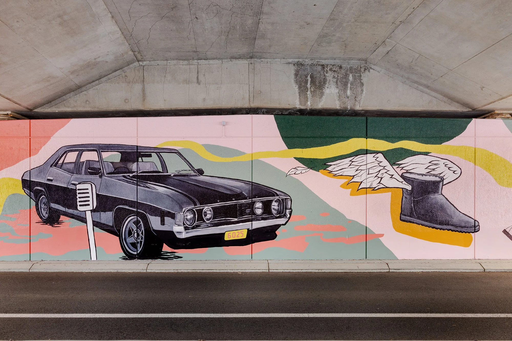
The design centres on a retro-themed drive-in movie scene, where a couple (complete with resplendent mullet and Farrah Fawcett waves) enjoy a date night with their beloved Kelpie and choc-milk in tow. It’s a loving nod to classic car culture, iconic hairstyles, and the all-terrain status of Ugg boots—details drawn directly from Fieldey's own experience of life in Craigie.
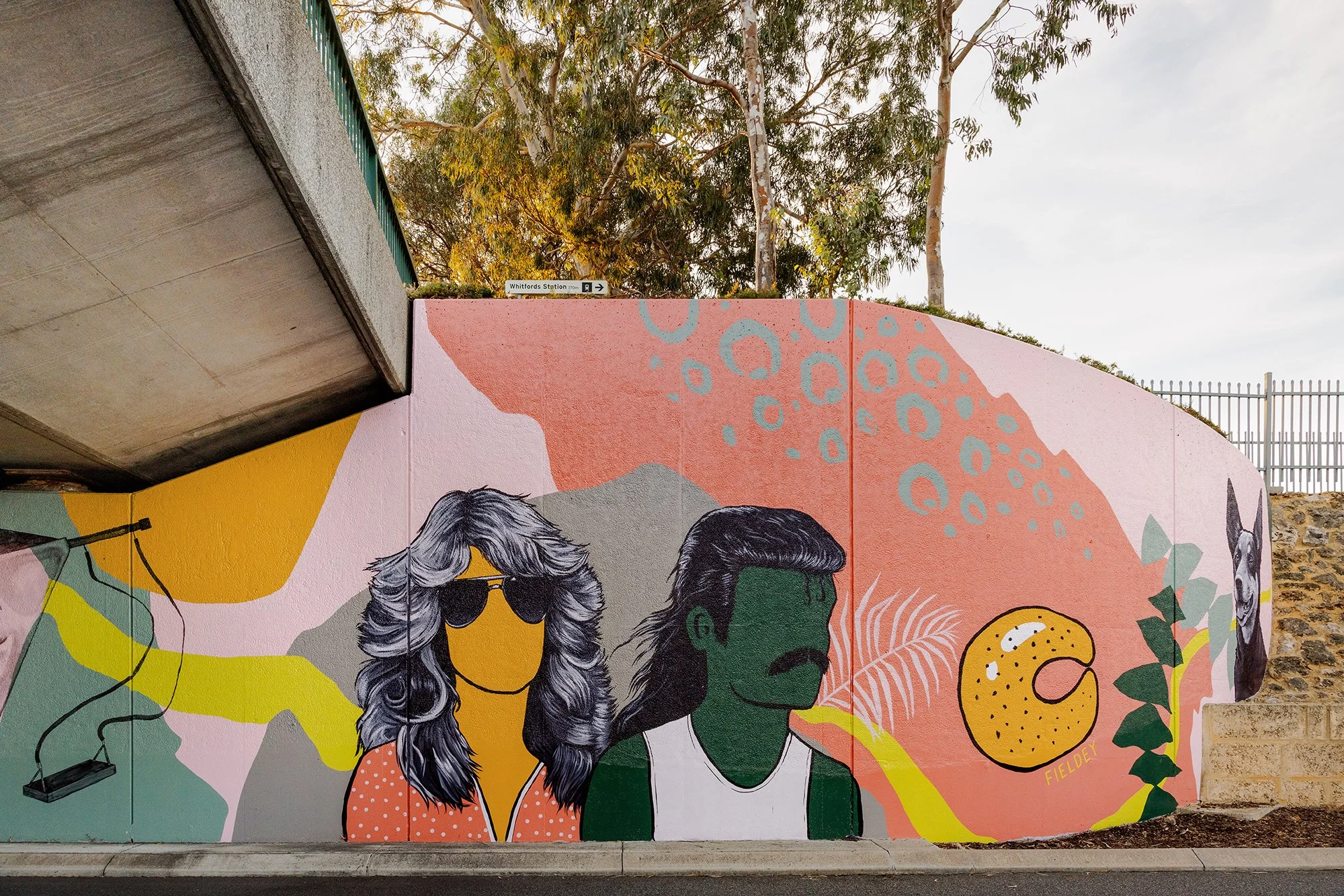
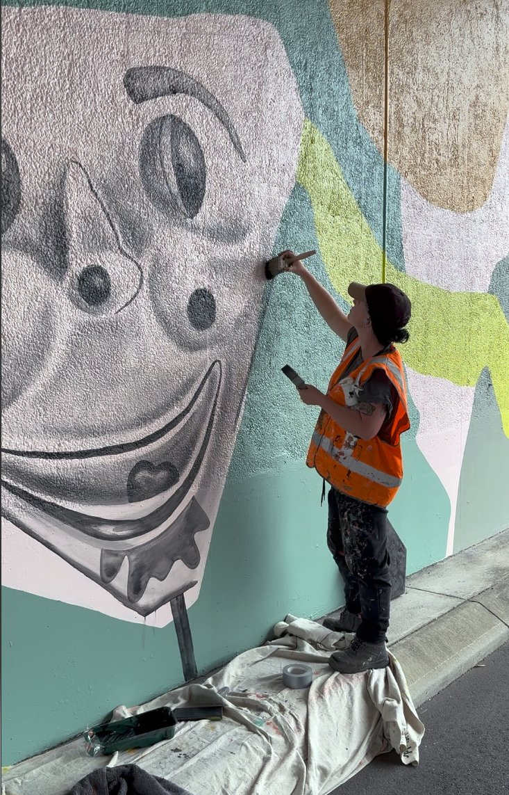
The creative process behind the mural was equally rooted in community connection. Fieldey reached out to residents via local Facebook groups, inviting them to share their memories of growing up in the area. The nostalgic and often hilarious responses inspired many of the mural’s key features: home milk deliveries, horse-shoe rolls, the Binishell dome, black cockatoos and banksias, and even the infamous creepy clown swing. These stories were lovingly woven into the composition, ensuring the final piece feels both personal and collective.
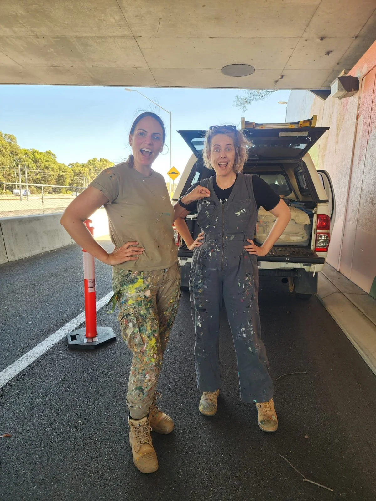
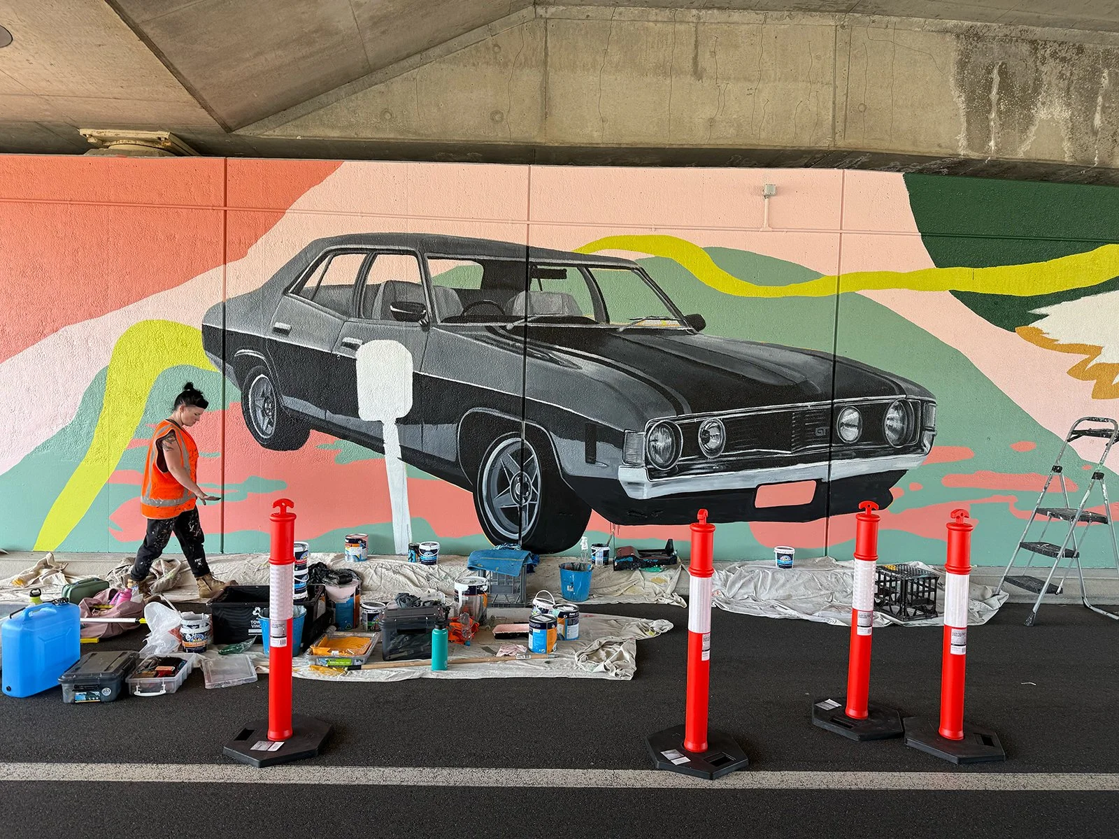
A team of three artists joined Fieldey to bring the mural to life over six days of painting. Together, they transformed the site into a flowing visual narrative that embraces the curve of the wall and is visible from both the freeway and nearby carpark. A dynamic green line snakes through the composition, connecting each element and referencing both physical travel and the deeper idea of intergenerational connection. The artwork’s bright, retro-inspired palette was developed from the Main Roads colour schemes for Hepburn to Whitfords and Whitfords to Ocean Reef, with a splash of bold pink added to modernise and unify the work.
True to its name, Retro Roots & Suburban Boots is more than a nostalgic throwback—it’s a reflection on how much has changed, and how much remains. Classic cars still cruise the streets, mullets have made their comeback, and Ugg boots are as essential as ever. The mural captures that sense of enduring identity, playfulness and local pride with boldness, humour and heart.
Retro Roots & Suburban Boots is Fieldey’s newest mural, a nostalgic love letter to the working-class charm of Perth’s northern suburbs from the 1970s through the 1990s. Painted in Craigie, where Fieldey first landed after moving to Perth, the artwork blends personal memories with stories gathered from the local community to create a lively portrait of suburban life.
At the centre of the design is a retro drive-in movie scene: a couple on date night, complete with a glorious mullet, Farrah Fawcett waves, a loyal Kelpie and a choc-milk on hand. It is a playful nod to classic car culture, iconic hairstyles and the everyday comforts like trusty Ugg boots that defined life in Craigie during that era.
The mural’s details were shaped by the community itself. Fieldey reached out to residents through local Facebook groups, inviting them to share their favourite stories from growing up in the area. Their memories, funny, heartfelt and wonderfully specific, inspired many of the mural’s elements, including home milk deliveries, horse-shoe rolls, the Binishell dome, black cockatoos and banksias, and even the infamous creepy clown swing. These slices of local history were woven throughout the composition so the artwork feels both deeply personal and unmistakably Craigie.
The mural was brought to life by a team of three artists over six days of painting. Together, they transformed the curved wall into a flowing visual narrative visible from both the freeway and the nearby carpark. A sweeping green line travels through the artwork, linking each vignette and symbolising both physical movement and intergenerational connection. The retro-inspired palette draws from Main Roads colour schemes for Hepburn to Whitfords and Whitfords to Ocean Reef, with an added hit of bold pink to freshen and unify the design.
True to its name, Retro Roots & Suburban Boots is not just a nostalgic throwback. It is a celebration of what gives the northern suburbs their character. Some things have changed, but many have not. Classic cars still roam, mullets are back and Ugg boots remain essential. The mural captures that enduring sense of place with humour, colour and heart.


Whiteman Park Underpass Murals
As part of the METRONET Morley–Ellenbrook Line project, I had the honour of collaborating with artist Rohin Kickett to create Seen/Unseen, a large-scale mural for the pedestrian underpass at Whiteman Park Station. Together, we set out to create a visually striking and conceptually layered artwork that would reflect the unique relationship between water, land and people in the Bennett Brook catchment.
The mural is spread across both sides of the underpass, with each wall exploring different aspects of this vital landscape. The north wall focused on the Seen and the Unseen: the surface waters of Bennett Brook and the underground Gnangara Mound aquifer. By layering aerial views with hydro-geographical mapping, we aimed to invite viewers to reflect on how we visualise place, and how so much of what shapes it lies beneath the surface.
Rohin’s style brought a deeply cultural dimension to the work, combining Western mapping techniques with Noongar storytelling. His influence allowed us to present Country as a deeply interconnected space, where every element – from the visible creeks to the underground flows – plays a role in sustaining life.
On the south wall, we mirrored the format of the north but shifted the perspective. The Gnangara Mound was shown as a hidden void – a quiet, powerful force. We introduced ghostly images of animals that rely on this water source, such as fish and waterbirds, highlighting the fragile balance of the ecosystem. Overlays of modern infrastructure, like roads and rail lines, were interwoven with the ancient Biddi (Indigenous pathways), drawing connections between past and present, built and natural, seen and unseen.
My contribution came through the addition of detailed, realistic paintings of native flora and fauna found in Whiteman Park. These were carefully integrated into the layers of mapping and storytelling, representing the quiet but constant presence of wildlife in the area. These details offered a further way for viewers to see the land not just as space, but as a living, breathing entity.
Seen/Unseen was more than just a mural – it was a visual and cultural journey. It was about acknowledging the ongoing story of this landscape and inviting people to see beyond what’s immediately visible. By combining art, history, and ecology, Rohin and I hoped to offer something that would resonate with commuters, residents, and visitors alike – a reminder of the rich, layered connections that bind people to place.


Surfboard Graphic to Promote CITROËN Europe & Ripcurl's NEW CACTUS C4
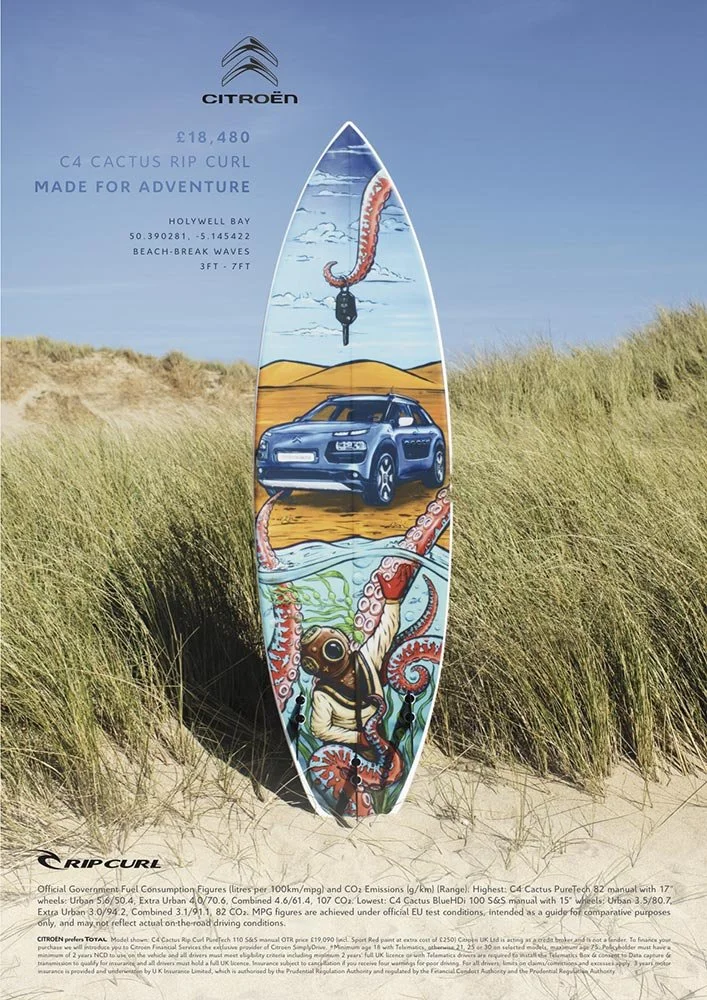
Back in March 2016, I had the incredible opportunity to be part of a unique project with Havas Work Club in London. The campaign aimed to launch the new RipCurl edition Citroën C4 Cactus, and they wanted to combine surf culture with automotive style in a way that hadn't been done before. To bring this vision to life, they called on three of the world’s best surf artists—one of which was me, representing Australia.
We were challenged with creating custom surfboard graphics that would not only fit the vibe of Citroën’s rugged yet stylish vehicle but also align with RipCurl's spirit of adventure. To make it even more exciting, we were asked to film the entire process on GoPro cameras to give fans a behind-the-scenes look at how we created the art. The idea was to make the campaign feel as authentic as the boards we were painting.

In March 2016, I had the incredible opportunity to be part of a unique project with Havas Work Club in London. The campaign aimed to launch the new RipCurl edition Citroën C4 Cactus, and they wanted to combine surf culture with automotive style in a way that hadn't been done before. To bring this vision to life, they called on three of the world’s best surf artists—one of which was me, representing Australia.
We were challenged with create custom surfboards that would fit the vibe of Citroën’s rugged yet stylish vehicle and align with RipCurl's spirit of adventure. To make it even more exciting, we were asked to film the entire process on GoPro cameras to give fans a behind-the-scenes look at how we created the art. The idea was to make the campaign feel as authentic as the boards we were painting.
For my part, I hand-painted an artwork that was inspired by the natural textures of surfboards and the energy of the ocean. After completing the piece, I carefully photographed it, digitised the image to meet the agency’s specifications, and sent it off to Havas in London. They printed the artwork onto a mesh inlay, which was then glassed into specially handcrafted surfboards.
The real magic happened when those boards were photographed in their natural element—alongside the Citroën C4 Cactus. The final result was stunning: a fusion of art, sport, and the open road that was showcased in print and online across Europe. The campaign a huge success and the boards were later auctioned off for charity, giving back to The Wave Project; a group based in Cornwall, that help young adults to gain confidence and reduce anxiety through surfing,
The "making of" videos we filmed became a powerful tool in promoting the campaign, giving viewers a glimpse of the creative process and the passion behind each board. It was an amazing experience to be a part of such a global project that brought together the worlds of surfing, automotive design, and art.
Click to read more about the campaign and see the boards in action!


Iron Fist Clothing Merchandise
I had the privilege of partnering with Iron Fist Clothing between 2013 and 2015 to create hand-painted artwork for their clothing ranges. This collaboration involved designing artwork that embodied the brand’s edgy, bold aesthetic while being adaptable across a diverse array of merchandise.
The challenge was to create artwork with a hand-painted feel while delivering high-resolution digital files, ensuring the designs could be reproduced across various items, from shoes and bags to clothing and bikinis. The brief was clear: the designs needed to be vibrant, fun, and youthful, perfectly aligning with Iron Fist’s alternative, femme-focused customer base.


I had the privilege of partnering with Iron Fist Clothing between 2013 and 2015 to create hand-painted artwork for their clothing ranges. This collaboration involved designing artwork that embodied the brand’s edgy, bold aesthetic while being adaptable across a diverse array of merchandise.
The challenge was to create artwork with a hand-painted feel while delivering high-resolution digital files, ensuring the designs could be reproduced across various items, from shoes and bags to clothing and bikinis. The designs needed to be vibrant, fun, and youthful - perfectly aligning with Iron Fist’s alternative, femme-focused customer base.
Over the course of the three years, I produced six unique pieces of artwork. These designs were applied to a wide range of apparel, helping to define the brand's distinct identity and appeal to a broad audience. It was incredibly rewarding to see my art featured across so many different products, knowing it resonated with Iron Fist’s customers around the world.


