

Illustration Project Grows at Rehoboth Christian CollegeChristian College
What began as a small commission for a few website illustrations quickly evolved into one of my most rewarding and expansive illustration projects to date – a full suite of 45 illustrations for Rehoboth Christian College, now featured across their website, publications, strategic plan, email footers, signage, and even school buses.
The original brief called for a modern, sketch-style set of characters to reflect the College’s vibrant and diverse community. I was asked to create 8–10 student illustrations and 4–5 adult staff figures, with the possibility of reimagining some of the school’s existing graphics in the new style for continuity. The creative direction focused on subtle movement, muted tones, and a blend of realism with hand-drawn charm. As one email described it:
“I like the relatively abstract style – it’s not aiming for 100% realism, but it’s also not too cartoony… the sketched look and muted colours are great.”
The team’s favourite reference was an image of a girl in a hat, which blended photography, illustration, and collage – an aesthetic that became the visual touchstone for the entire project. The goal was to capture the College’s spirit through warm, expressive illustrations that showcased real diversity – in age, ethnicity, style, and personality – while remaining clean and professional for use across media.
The overwhelmingly positive feedback led to a significant scale-up. It’s been incredibly rewarding to see the illustrations come to life across so many touchpoints, from digital to print and even in animated elements on the web.
Rehoboth Christian College describes itself as “a Christian college, but very forward-thinking” – and this project reflects that perfectly. It was a joy to work with a team that embraced creativity, valued visual storytelling, and gave me the freedom to bring their community to life in a fresh and modern way.

What began as a small commission for a few website illustrations quickly evolved into one of my most rewarding and expansive illustration projects to date – a full suite of 45 illustrations for Rehoboth Christian College, now featured across their website, publications, strategic plan, email footers, signage, and even school buses.
The original brief called for a modern, sketch-style set of characters to reflect the College’s vibrant and diverse community. I was asked to create 8–10 student illustrations and 4–5 adult staff figures, with the possibility of reimagining some of the school’s existing graphics in the new style for continuity. The creative direction focused on subtle movement, muted tones, and a blend of realism with hand-drawn charm. As one email described it:
“I like the relatively abstract style – it’s not aiming for 100% realism, but it’s also not too cartoony… the sketched look and muted colours are great.”
The goal was to capture the College’s spirit through warm, expressive illustrations that showcased real diversity – in age, ethnicity, style, and personality – while remaining clean and professional for use across media.
The overwhelmingly positive feedback led to a significant scale-up. It’s been incredibly rewarding to see the illustrations come to life across so many touchpoints, from digital to print and even in animated elements on the web.
Rehoboth Christian College describes itself as “a Christian college, but very forward-thinking” – and this project reflects that perfectly. It was a joy to work with a team that embraced creativity, valued visual storytelling, and gave me the freedom to bring their community to life in a fresh and modern way.


Cowden Park Mural, West Leederville
I recently completed another beautiful piece - an EOI tender to revamp the Cowden Park toilet block, working alongside students from West Leederville Primary School.
For this project, I kicked things off with a concept-building workshop with the students. We explored the theme "Celebrating the beauty of our area," and they came up with incredible ideas that I could incorporate into the mural.
The final design is a fun and vibrant piece that wraps around the building, cleverly integrating areas of the original color to tie it back to its surroundings. A blue horizon line symbolizes Lake Monger, with silhouettes of people enjoying the walking and cycling paths. Native flora and fauna add a local touch, celebrating the area's natural beauty.
To make this project truly community-driven, my team and I created "paint-by-numbers" outlines on the wall. The students then had a painting day, filling in all the flat color areas. They absolutely loved it, and it was amazing to see them proudly point out "their bit" of the mural to friends and family.
I completed the final details, painting realistic birds and animals, and we finished it off with an anti-graffiti coating to ensure longevity.
This project was such a rewarding experience, blending community involvement with creativity.


Tom Carroll Portrait
Back in 2016, I had the incredible opportunity to meet former world champion big-wave surfer Tom Carroll at his home in Sydney’s Northern Beaches. The visit wasn’t just to talk surfing – I was there to photograph and sketch Tom in his home environment, alongside his much-loved cat, Chino, as preparation for a portrait painting.
The final artwork captured a quiet, introspective moment between man and animal – a side of Tom not often seen in the public eye. While he’s well known for his fearless approach to surfing, what struck me most was his warmth, humility, and humour. He had the energy of someone who’d lived deeply, but had arrived at a place of peace and self-acceptance. I wanted to translate that into the painting – to reflect not only his achievements but his essence.
My portrait style uses layers of acrylic paint to build depth and texture. The early layers are loose and expressive, creating an emotional base. With each additional layer, I refine the details, gradually guiding the viewer’s attention. In this piece, the more realistic elements were deliberately placed to anchor the composition, allowing the freer, painterly parts to breathe. It’s a balance I love exploring – between structure and spontaneity, realism and emotion.
This portrait of Tom and Chino remains one of my favourites – not just for the final result, but for the experience of meeting someone so iconic and finding, in that moment, something truly human to share.


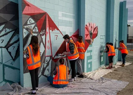
"Homecoming" - a 40m Long Mural for High Wycombe Train Station
I had the privilege of collaborating with the Public Transport Authority, Right Track, and the City of Kalamunda to create a lasting piece of public art. The location was unique: a 38-meter-long, 2.6-meter-high curved wall on Ibis Place in High Wycombe, near the newly established High Wycombe train station. The wall surrounds an electrical substation and is a prominent feature for pedestrians, cyclists, and drivers accessing the station precinct. The goal was to design an artwork that would not only blend with its surroundings but also resonate with the community that interacts with it daily.
The design process began with a workshop involving a group of young people from the Right Track program. The participants identified key themes that would guide the artwork, including connection, the natural beauty of Kalamunda, and local flora and fauna. The animals that were particularly meaningful to the group—such as Black Cockatoos, Jacarandas, and Kangaroos—became central to the mural’s narrative.
Taking these themes to heart, I developed a design that transitions from the geometric shapes of the city to the organic, natural forms found in the surrounding hills. The left side of the wall features sharp, angular shapes that represent the city, while the right side showcases more realistic depictions of the animals—Black Cockatoos, Kangaroos, and Jacarandas—symbolizing the journey home from work through the familiar landscapes of the hills. The transformation of these geometric city animals into more lifelike forms of wildlife reflects the commuters’ own transition from the urban environment to the serene, natural beauty of their hometowns.
The mural’s unique, curved structure means that it must be walked around to fully experience the artwork, mimicking the unfolding landscape as viewed from a moving train. This design invites viewers to engage with the mural as they move through the space, creating a dynamic experience that is always in motion.

Community Mural for Weeip Park Development
As an artist, I believe in the power of art to foster community identity and engagement. The Weeip Park Community Art Mural was a project designed to do just that—creating a vibrant landmark for the Weeip Park Youth Space while involving the young people of Midland to take part as active stakeholders in their own community.
To ensure the mural reflected the voices and experiences of the local youth, I conducted five youth engagement brainstorming sessions and a dedicated workshop. These sessions were designed to gather a diverse range of ideas and stories, ensuring the final artwork was both meaningful and representative of the community. Additionally, drawing on my experience as a YouTube creator, I developed a custom video to promote the project—meeting young people on a platform they use and identify with.
A major theme of the mural is connection—both in the literal sense of Midland’s role as a transport hub and in the way young people come together in shared spaces. The design features colourful squares and shapes that form a semi-realistic map of Midland, highlighting key locations such as schools and Midland Gate. These elements were designed to be accessible for all skill levels, allowing participants to contribute during six community painting days that I facilitated.
Complementing this dynamic map are personal stories and memories, expressed through realistic black-and-white imagery and accompanying text. These contributions, provided by individual young people, create a story trail that visitors can follow throughout the park. The result is a mural that not only enhances the space visually but also serves as a testament to the significance of creative arts in building community and offering young people a sense of belonging and purpose.
This project exemplifies the role of art in shaping public spaces, fostering engagement, and demonstrating to the youth of Midland that creativity is a powerful tool for storytelling, connection, and professional opportunity. I am honoured to have been part of this initiative, and I look forward to seeing the impact it will continue to have on the community.


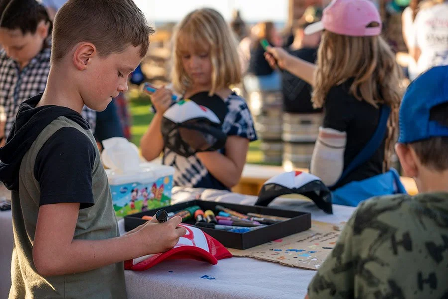
Beachside Painting Workshops for Fringe Festival
The City of Stirling approached me to run custom 'drop-in' trucker painting workshops at the stunning Sunset Veranda during the Fringe World Festival. This free activity aimed to kids, parents, and other festival goers.
Over the course of the festival, we facilitated multiple three-hour drop-in workshops. People of all ages showed up eager to customise their very own trucker caps. Each participant could choose from four different coloured caps, and we supplied all the paint pens and pencils needed to turn a blank canvas into something truly special.
The concept was designed to be laid-back and accessible. With the drop-in style, we could accommodate up to 50 people in just two hours, which meant we could include as many participants as possible throughout the day. It also meant that we could cater to different age groups and attention spans.
What I loved the most was seeing the creativity flow, especially when the kids realised they could create their very own piece of wearable art. It was amazing to watch them get absorbed in the painting process, knowing that they would walk away with something they could wear with pride. The joy on their faces when they finished their caps—some even proudly rocking them to school after—was priceless.
For those who wanted to get even more creative, we allowed participants to bring along their surfboards or skateboards, providing an opportunity for them to paint on their own gear.
All in all, the workshops were a huge success. They offered a free, engaging activity for festival-goers that brought the community together in a way that felt relaxed and creative. Seeing people of all ages come together to express their own style through art—whether on a cap, board, or just on paper—displayed the spirit of Perth Fridge - creativity without borders.


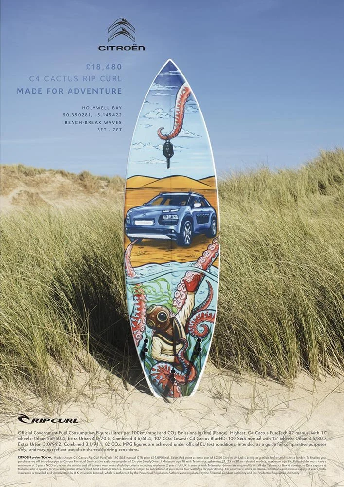
Surfboard Graphic to Promote CITROËN Europe & Ripcurl's NEW CACTUS C4
Back in March 2016, I had the incredible opportunity to be part of a unique project with Havas Work Club in London. The campaign aimed to launch the new RipCurl edition Citroën C4 Cactus, and they wanted to combine surf culture with automotive style in a way that hadn't been done before. To bring this vision to life, they called on three of the world’s best surf artists—one of which was me, representing Australia.
We were challenged with creating custom surfboard graphics that would not only fit the vibe of Citroën’s rugged yet stylish vehicle but also align with RipCurl's spirit of adventure. To make it even more exciting, we were asked to film the entire process on GoPro cameras to give fans a behind-the-scenes look at how we created the art. The idea was to make the campaign feel as authentic as the boards we were painting.

In March 2016, I had the incredible opportunity to be part of a unique project with Havas Work Club in London. The campaign aimed to launch the new RipCurl edition Citroën C4 Cactus, and they wanted to combine surf culture with automotive style in a way that hadn't been done before. To bring this vision to life, they called on three of the world’s best surf artists—one of which was me, representing Australia.
We were challenged with create custom surfboards that would fit the vibe of Citroën’s rugged yet stylish vehicle and align with RipCurl's spirit of adventure. To make it even more exciting, we were asked to film the entire process on GoPro cameras to give fans a behind-the-scenes look at how we created the art. The idea was to make the campaign feel as authentic as the boards we were painting.
For my part, I hand-painted an artwork that was inspired by the natural textures of surfboards and the energy of the ocean. After completing the piece, I carefully photographed it, digitised the image to meet the agency’s specifications, and sent it off to Havas in London. They printed the artwork onto a mesh inlay, which was then glassed into specially handcrafted surfboards.
The real magic happened when those boards were photographed in their natural element—alongside the Citroën C4 Cactus. The final result was stunning: a fusion of art, sport, and the open road that was showcased in print and online across Europe. The campaign a huge success and the boards were later auctioned off for charity, giving back to The Wave Project; a group based in Cornwall, that help young adults to gain confidence and reduce anxiety through surfing,
The "making of" videos we filmed became a powerful tool in promoting the campaign, giving viewers a glimpse of the creative process and the passion behind each board. It was an amazing experience to be a part of such a global project that brought together the worlds of surfing, automotive design, and art.
Click to read more about the campaign and see the boards in action!


Iron Fist Clothing Merchandise
I had the privilege of partnering with Iron Fist Clothing between 2013 and 2015 to create hand-painted artwork for their clothing ranges. This collaboration involved designing artwork that embodied the brand’s edgy, bold aesthetic while being adaptable across a diverse array of merchandise.
The challenge was to create artwork with a hand-painted feel while delivering high-resolution digital files, ensuring the designs could be reproduced across various items, from shoes and bags to clothing and bikinis. The brief was clear: the designs needed to be vibrant, fun, and youthful, perfectly aligning with Iron Fist’s alternative, femme-focused customer base.


I had the privilege of partnering with Iron Fist Clothing between 2013 and 2015 to create hand-painted artwork for their clothing ranges. This collaboration involved designing artwork that embodied the brand’s edgy, bold aesthetic while being adaptable across a diverse array of merchandise.
The challenge was to create artwork with a hand-painted feel while delivering high-resolution digital files, ensuring the designs could be reproduced across various items, from shoes and bags to clothing and bikinis. The designs needed to be vibrant, fun, and youthful - perfectly aligning with Iron Fist’s alternative, femme-focused customer base.
Over the course of the three years, I produced six unique pieces of artwork. These designs were applied to a wide range of apparel, helping to define the brand's distinct identity and appeal to a broad audience. It was incredibly rewarding to see my art featured across so many different products, knowing it resonated with Iron Fist’s customers around the world.


LIQUITEX Skate Art for OZ Comic-Con
In April 2015, Jasco commissioned artist Fieldey to create three unique skate decks for display at Oz Comic-Con in Melbourne, showcasing the versatility of Liquitex products. Fieldey used her signature graffiti-inspired techniques, including basic fades, a liquid soap effect, and chains as stencils, to bring her designs to life.
The three decks featured distinct themes: a Little Red Riding Hood-inspired design, a wild blue and green bulldog, and a tattoo-style board with skulls and chains. Each piece demonstrated how Liquitex aerosol and acrylic paints could work together to create vibrant, textured artworks.
In April 2015, Jasco commissioned me to create three unique skate decks for display at Oz Comic-Con in Melbourne, showcasing the versatility of Liquitex paint products.
I focused on graffiti-inspired techniques, including basic fades, a liquid soap effect, and chains as stencils, to bring my designs to life.
Each skate deck is a storytelling piece - a "Story Boards".
Little Red Riding Hood-Inspired Deck: This design took a playful, dark twist on the classic fairy tale character, with Fieldey’s signature blend of colors and sharp contrasts.
Crazy Blue/Green Bulldog Deck: A wild, energetic design featuring a bulldog in vibrant blues and greens, this deck was a bold representation of Fieldey’s high-energy artistic style.
Skulls and Chains Tattoo-Inspired Deck: With intricate detailing and a moody, monochrome color scheme, this deck captured the essence of tattoo art, showcasing a mastery of both spray paint and acrylic techniques.
A “making of” video, which documents my process from start to finish, was played throughout the event, offering viewers an intimate glimpse of the artistic journey behind the skate decks. The video was later shared across Liquitex Australia’s social media channels, amplifying the success of the collaboration and showcasing my approach to using Liquitex products.
The collaboration brought a burst of color and creativity to an already vibrant Oz Comic-Con, and also highlighted the endless possibilities of Liquitex paints in the hands of a skilled artist. I am always delighted to have oppertunities to work at the intersection of street art and fine craftsmanship.


Custom surfboard project for Anytime fitness
When Anytime Fitness needed five custom surfboards as prizes for their 2013 annual conference in Minnesota, they turned to renowned artist Fieldey to bring the vision to life. Fieldey was excited to take on the project but quickly realised that sourcing surfboards in an inland state would be far more difficult than in Australia.
To keep things cost-effective, Fieldey arranged for the boards to be shaped in the U.S., tracking down the only shaper in a neighbouring landlocked state. With the surfboards in production, Fieldey collaborated with Anytime Fitness’ in-house design team to adapt their graphics onto digital surfboard templates.
To ensure a flawless finish, the artwork was printed onto specialised surfboard mesh inlays by an Australian company before being shipped to the U.S. for application during manufacturing. The final result? Five stunning, high-quality surfboards delivered to Minnesota just in time for the conference.
Through creative problem-solving and international collaboration, Fieldey helped Anytime Fitness make waves—without a coastline in sight.

When Anytime Fitness needed five custom surfboards as prizes for their 2013 annual conference in Minnesota, I was thrilled to bring their vision to life. I was excited to take on the project but quickly realized that sourcing surfboards in an inland state would be far more difficult than in Australia.
To keep things cost-effective, I arranged for the boards to be shaped in the U.S., tracking down the only shaper in a neighboring landlocked state. With the surfboards in production, I collaborated with Anytime Fitness' in-house design team to adapt their graphics onto digital surfboard templates.
To ensure a flawless finish, I had the artwork printed onto specialized surfboard mesh inlays by an Australian company before shipping it to the U.S. for application during manufacturing. The final result? Five stunning, high-quality surfboards delivered to Minnesota just in time for the conference.
Through creative problem-solving and international collaboration, I helped Anytime Fitness make waves—without a coastline in sight.

