

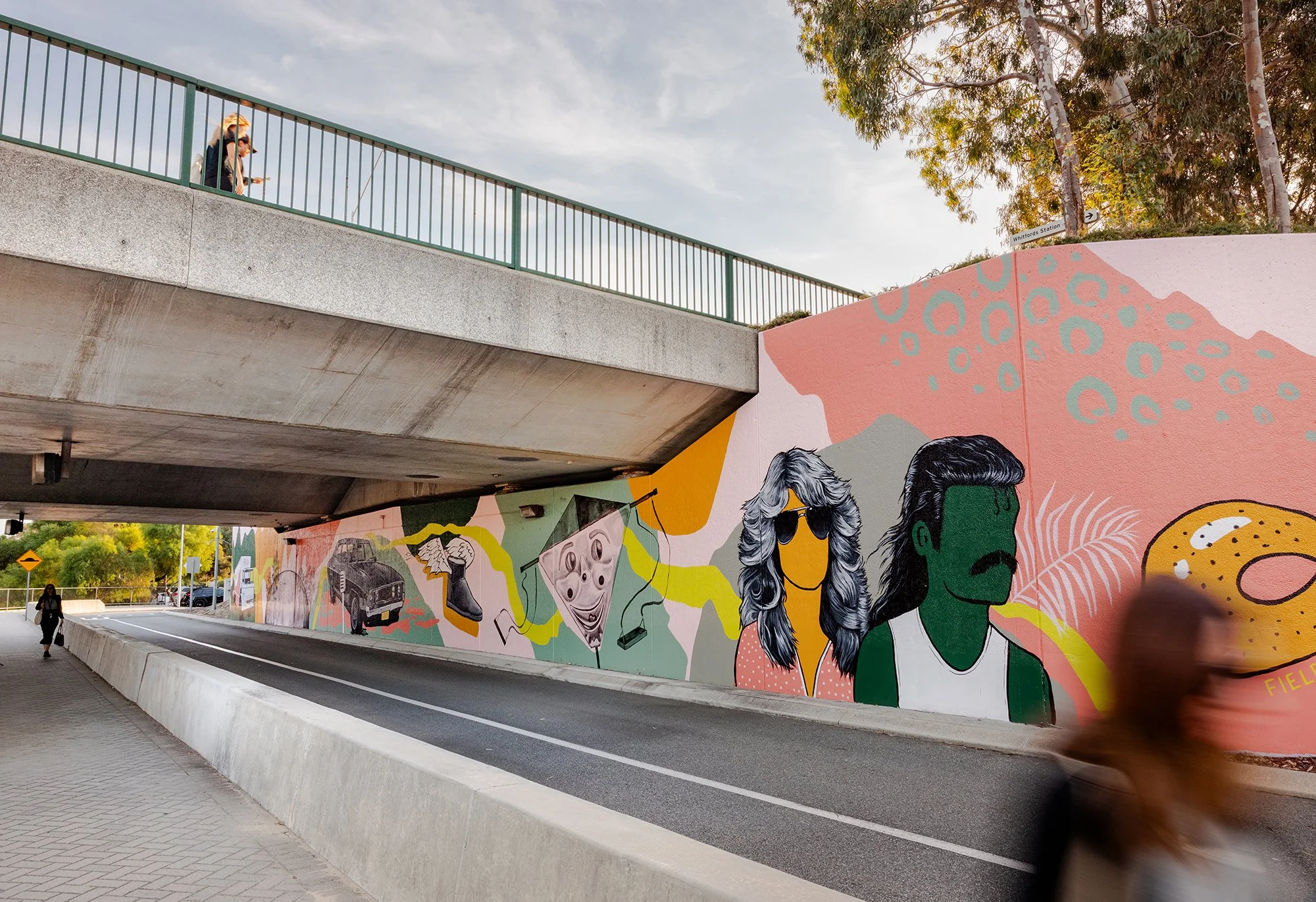
Retro Roots & Suburban Boots
Fieldey’s newest mural, Retro Roots & Suburban Boots, is a love letter to the working-class charm of Perth’s northern suburbs from the 1970s through to the 1990s. With Retro Roots & Suburban Boots, Fieldey offers a vibrant, layered response to place—celebrating the working-class identity and rich suburban culture of Perth’s northern suburbs from the 1970s through to the 1990s. Situated in Craigie, where the artist first settled after moving to Perth, the mural interweaves personal narrative with community-sourced memories to tell a collective story of time and belonging.
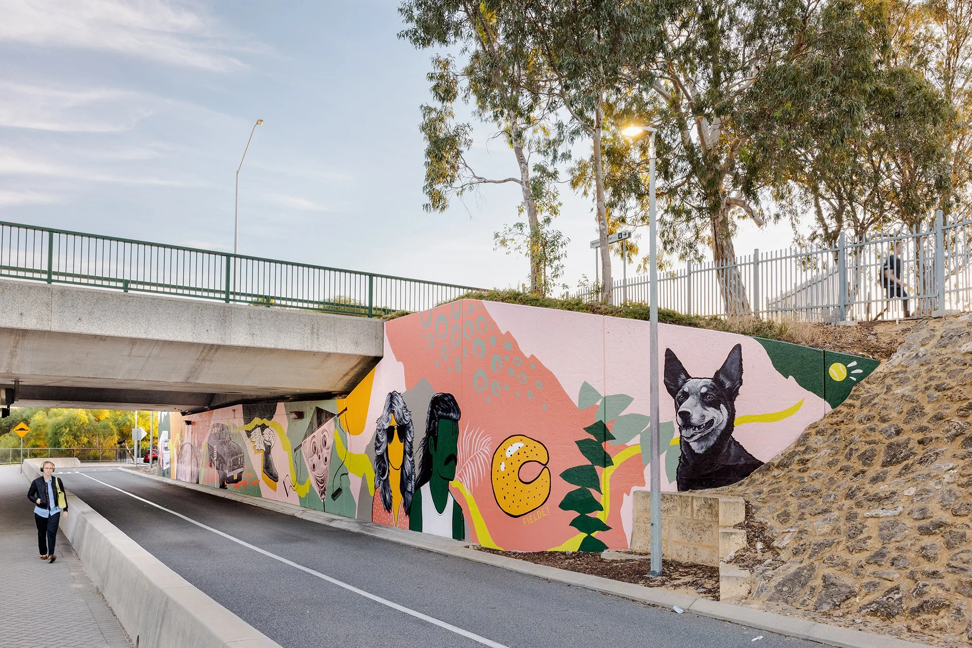
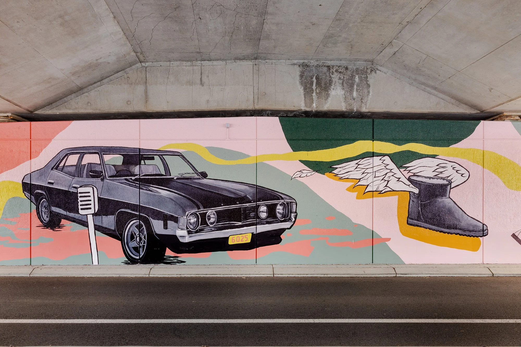
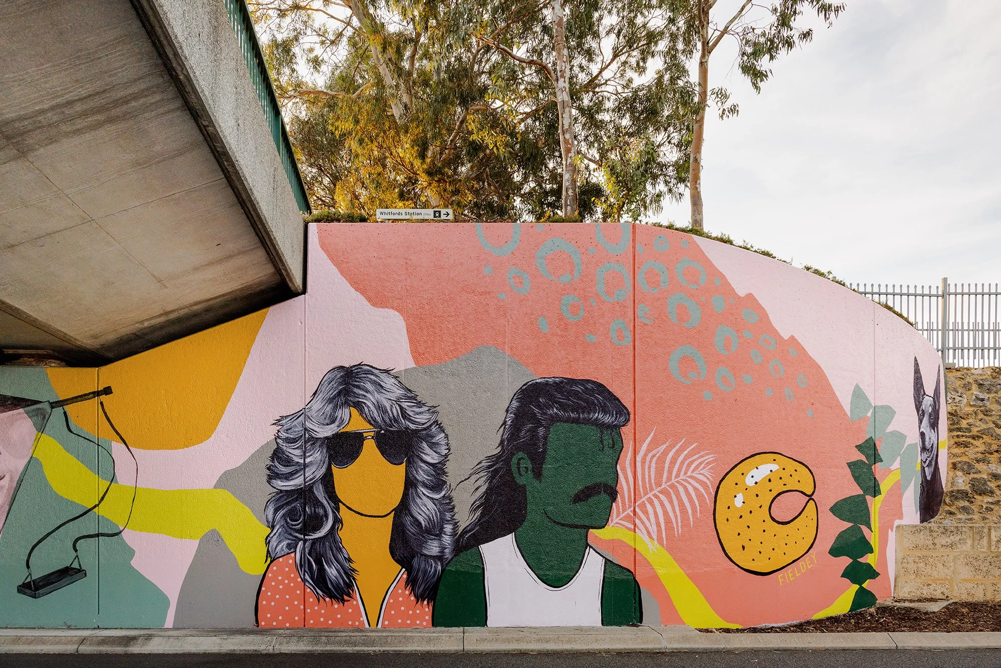
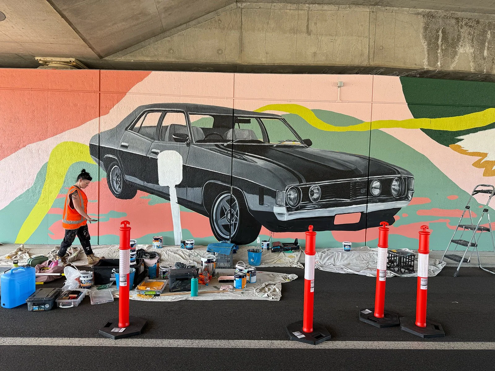
The design centres on a retro-themed drive-in movie scene, where a couple (complete with resplendent mullet and Farrah Fawcett waves) enjoy a date night with their beloved Kelpie and choc-milk in tow. It’s a loving nod to classic car culture, iconic hairstyles, and the all-terrain status of Ugg boots—details drawn directly from Fieldey's own experience of life in Craigie.
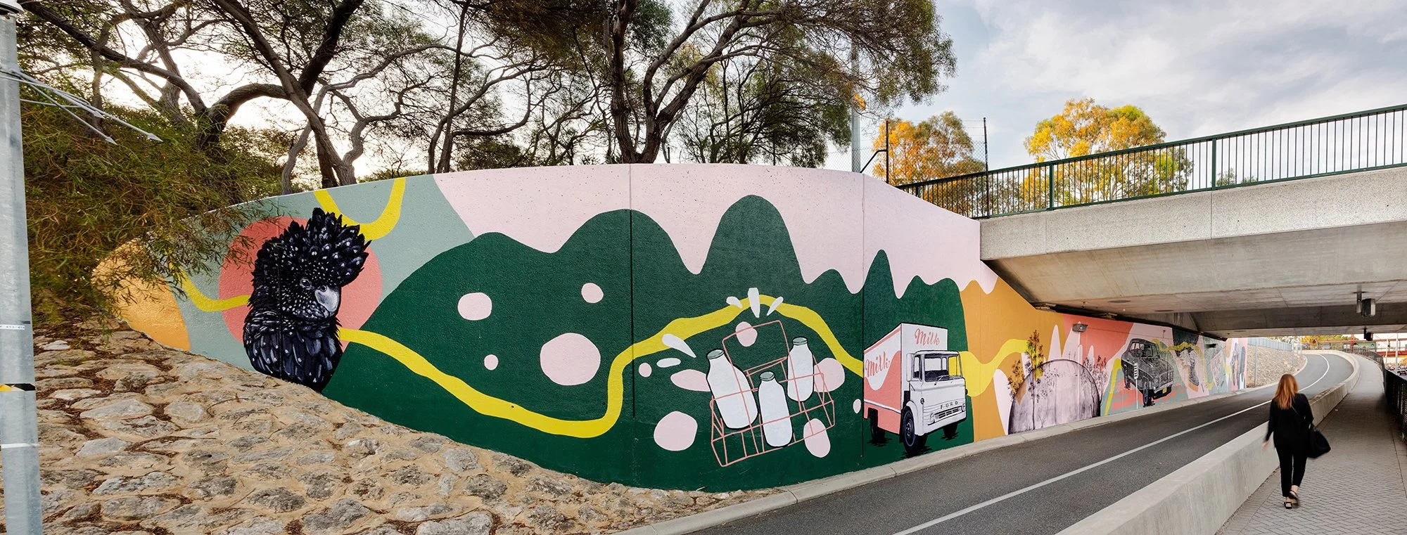
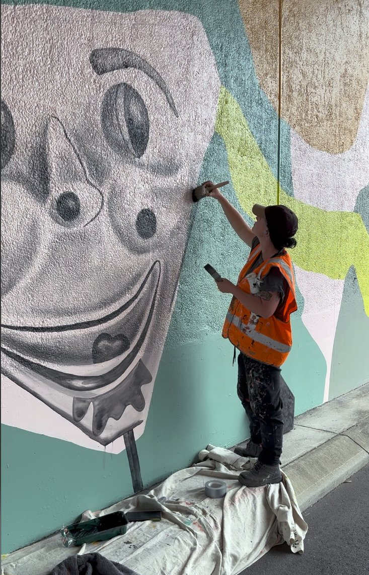
The creative process behind the mural was equally rooted in community connection. Fieldey reached out to residents via local Facebook groups, inviting them to share their memories of growing up in the area. The nostalgic and often hilarious responses inspired many of the mural’s key features: home milk deliveries, horse-shoe rolls, the Binishell dome, black cockatoos and banksias, and even the infamous creepy clown swing. These stories were lovingly woven into the composition, ensuring the final piece feels both personal and collective.
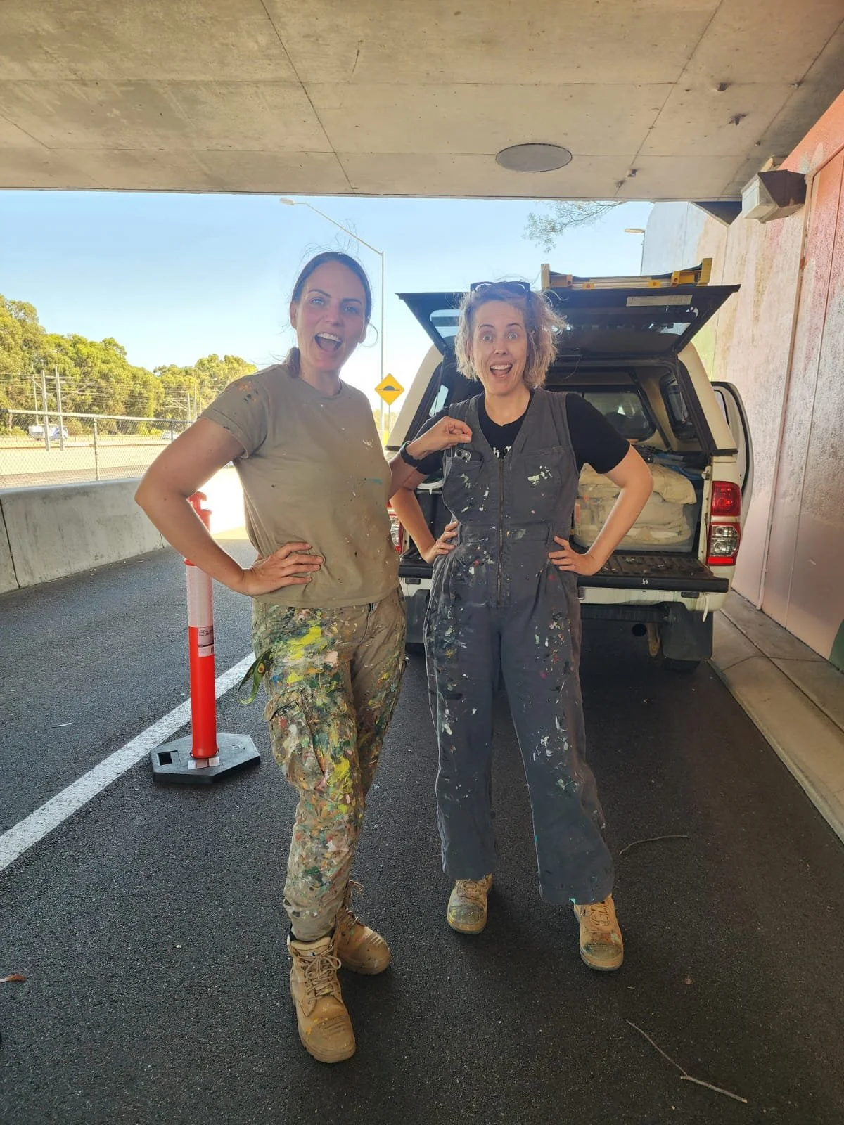
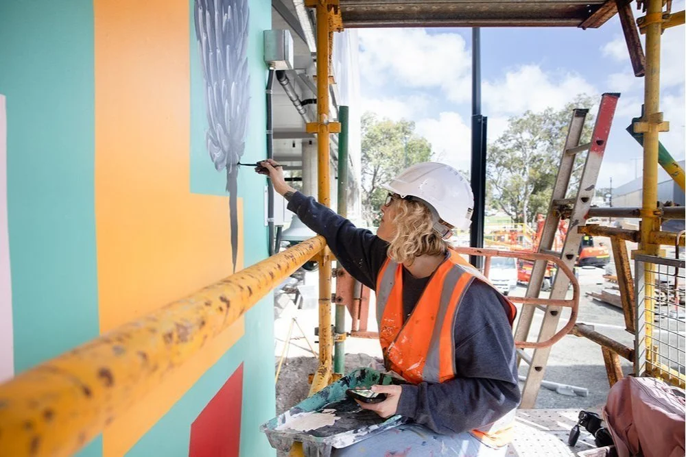
A team of three artists joined Fieldey to bring the mural to life over six days of painting. Together, they transformed the site into a flowing visual narrative that embraces the curve of the wall and is visible from both the freeway and nearby carpark. A dynamic green line snakes through the composition, connecting each element and referencing both physical travel and the deeper idea of intergenerational connection. The artwork’s bright, retro-inspired palette was developed from the Main Roads colour schemes for Hepburn to Whitfords and Whitfords to Ocean Reef, with a splash of bold pink added to modernise and unify the work.
True to its name, Retro Roots & Suburban Boots is more than a nostalgic throwback—it’s a reflection on how much has changed, and how much remains. Classic cars still cruise the streets, mullets have made their comeback, and Ugg boots are as essential as ever. The mural captures that sense of enduring identity, playfulness and local pride with boldness, humour and heart.
Retro Roots & Suburban Boots is Fieldey’s newest mural, a nostalgic love letter to the working-class charm of Perth’s northern suburbs from the 1970s through the 1990s. Painted in Craigie, where Fieldey first landed after moving to Perth, the artwork blends personal memories with stories gathered from the local community to create a lively portrait of suburban life.
At the centre of the design is a retro drive-in movie scene: a couple on date night, complete with a glorious mullet, Farrah Fawcett waves, a loyal Kelpie and a choc-milk on hand. It is a playful nod to classic car culture, iconic hairstyles and the everyday comforts like trusty Ugg boots that defined life in Craigie during that era.
The mural’s details were shaped by the community itself. Fieldey reached out to residents through local Facebook groups, inviting them to share their favourite stories from growing up in the area. Their memories, funny, heartfelt and wonderfully specific, inspired many of the mural’s elements, including home milk deliveries, horse-shoe rolls, the Binishell dome, black cockatoos and banksias, and even the infamous creepy clown swing. These slices of local history were woven throughout the composition so the artwork feels both deeply personal and unmistakably Craigie.
The mural was brought to life by a team of three artists over six days of painting. Together, they transformed the curved wall into a flowing visual narrative visible from both the freeway and the nearby carpark. A sweeping green line travels through the artwork, linking each vignette and symbolising both physical movement and intergenerational connection. The retro-inspired palette draws from Main Roads colour schemes for Hepburn to Whitfords and Whitfords to Ocean Reef, with an added hit of bold pink to freshen and unify the design.
True to its name, Retro Roots & Suburban Boots is not just a nostalgic throwback. It is a celebration of what gives the northern suburbs their character. Some things have changed, but many have not. Classic cars still roam, mullets are back and Ugg boots remain essential. The mural captures that enduring sense of place with humour, colour and heart.

Morley Station Carpark
I was thrilled to win the tender to create a major public artwork for the Morley Station carpark as part of the METRONET project. My concept was selected because of its strong connection to Morley – it referenced iconic institutions and shared experiences from the past 40 years. I wanted the work to create a sense of continuity between the well-established, historical side of Morley and the new, modern space of the train station and its surrounds.
The final artwork was made up of three main areas: a blade wall, a series of perforated screens, and the level 1 balustrade wall. Together, they formed a bold, modern statement that helped shape the arrival and departure experience in a meaningful way.
The blade wall featured the word "Morley" in large, colourful, overlapping letters – a visual reference to the classic Morley Markets font. I included abstract patterns inspired by local history, with nods to the old Boans department store and architectural designs from the area. I also created detailed black-and-white illustrations of curry leaves, olives, dragon fruit and bananas, which tied into the perforated screens nearby.
The perforated screen artwork wrapped around the carpark and offered a modern-retro take on Morley’s past and present. I focused on edible plants as a visual motif, to reflect the influence of Morley’s multicultural communities and how they’ve shaped the local environment and culture.
The level 1 balustrade wall was where I really got to lean into the nostalgia. I combined archival images with playful, colourful references to local culture – starting with the old Boans department store and moving through scenes featuring the Morley Seal sculptures, the Wirrina Drive-In Theatre, and the much-loved Morley Rollerdrome. It was also important for me to acknowledge the area’s Italian and Asian communities, so I included details and colour palettes that spoke to those cultural influences.
This project was a joy to work on – not only because it allowed me to explore Morley’s rich history, but because it reminded me of the power public art has to connect people to place. I hope the finished work brings a sense of pride and recognition to the local community, while welcoming new visitors with a bold and colourful snapshot of what makes Morley unique.


Manners Hill Park Mural - Peppermint Grove
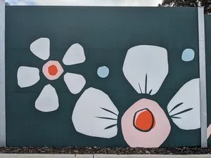
Securing the tender for Manner’s Hill Park was a testament to the strength of my concept—an elegant and contemporary design that incorporated local flora and fauna in a refined, understated manner.
With this being the Shire of Peppermint Grove’s first mural, my goal was to create an artwork that seamlessly embraced the building while respecting its natural environment. I opted for a modern Australian bush palette, introducing a bold feature colour to provide contrast and visual impact without overwhelming the setting.
To further integrate the mural with its surroundings, I worked with the existing colour of the wall, allowing the artwork to blend harmoniously with the architecture. The design itself is fluid, avoiding hard edges and instead flowing around the building’s sides and the toilet entry walls. This approach not only maximised the space but also ensured the piece felt organic and in tune with its environment.
Bringing this vision to life was a rewarding process, achieved with the support of two assistants over six days of painting. The result is a striking yet sympathetic addition to Peppermint Grove—a mural that enhances rather than imposes, offering a lasting connection between art and nature.


250m-Long Mural for Spearwood Ave, Yangebup
I was awarded a commission through an Expression of Interest (EOI) process to transform a 250-meter-long noise wall on Spearwood Avenue. The wall, which had originally been painted in a drab green colour, had long been an eyesore for the local residents. Positioned along a busy road where cars travel at speeds of up to 70 km/h, the wall had limited visibility to pedestrians, and the challenge was to create an engaging design that would be seen predominantly from passing vehicles.
The brief called for a simple, bright, and fun design that would uplift the area while also reflecting the unique characteristics of the suburb. To guide the design process, I held a community consultation workshop, where local residents shared their thoughts on what made Spearwood special. The feedback was invaluable, with many participants pointing out that the wall’s primary audience would be drivers rather than pedestrians, which meant that intricate details would not be visible. As a result, the design needed to focus on large, semi-abstract shapes that would be effective from a distance.
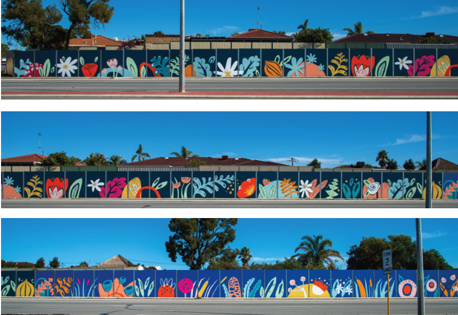
The mural itself is divided into three sections, each representing a different aspect of the suburb’s ecosystems. The leftmost section depicts the inland market gardens, which are a prominent feature of the area. This part of the mural features stylised representations of flowers and onions, reflecting the agricultural history of Spearwood. The middle section transitions into the wetlands, with abstract shapes representing plants such as banksia, bulrushes, gum trees, and tuart flowers. Finally, the mural moves into the coastal zone, showcasing flora such as pigface, Geraldton wax flowers, dune mosses, cushion bush, and seaweed—plants that are native to the region and reflect the suburb’s connection to the sea.
This thoughtful progression from inland market gardens to wetlands and then to the coast creates a visual narrative that mirrors the natural environment surrounding Spearwood. The design's bold and vibrant colours, combined with its large-scale semi-abstract shapes, ensure that the mural stands out from the passing traffic and provides a visual experience for drivers.
The project was completed over the course of nine days, with myself and a team of skilled assistants working to bring the design to life. The outcome is a mural that not only brightens the once-drab wall but also celebrates the local flora and fauna, giving the residents of Spearwood a meaningful and colourful representation of their community's unique ecosystems.
This project highlights the power of public art in transforming urban spaces and fostering a sense of pride and connection within the community. It was a rewarding experience to work closely with the residents and contribute to the aesthetic improvement of Spearwood Avenue.


I was awarded a commission through an Expression of Interest (EOI) process to transform a 250-meter-long noise wall on Spearwood Avenue. The wall, which had originally been painted in a drab green colour, had long been an eyesore for the local residents. Positioned along a busy road where cars travel at speeds of up to 70 km/h, the wall had limited visibility to pedestrians, and the challenge was to create an engaging design that would be seen predominantly from passing vehicles.
The brief called for a simple, bright, and fun design that would uplift the area while also reflecting the unique characteristics of the suburb. To guide the design process, I held a community consultation workshop, where local residents shared their thoughts on what made Spearwood special. The feedback was invaluable, with many participants pointing out that the wall’s primary audience would be drivers rather than pedestrians, which meant that intricate details would not be visible. As a result, the design needed to focus on large, semi-abstract shapes that would be effective from a distance.
The mural itself is divided into three sections, each representing a different aspect of the suburb’s ecosystems. The leftmost section depicts the inland market gardens, which are a prominent feature of the area. This part of the mural features stylised representations of flowers and onions, reflecting the agricultural history of Spearwood. The middle section transitions into the wetlands, with abstract shapes representing plants such as banksia, bulrushes, gum trees, and tuart flowers. Finally, the mural moves into the coastal zone, showcasing flora such as pigface, Geraldton wax flowers, dune mosses, cushion bush, and seaweed—plants that are native to the region and reflect the suburb’s connection to the sea.
This thoughtful progression from inland market gardens to wetlands and then to the coast creates a visual narrative that mirrors the natural environment surrounding Spearwood. The design's bold and vibrant colours, combined with its large-scale semi-abstract shapes, ensure that the mural stands out from the passing traffic and provides a visual experience for drivers.
The project was completed over the course of nine days, with myself and a team of skilled assistants working to bring the design to life. The outcome is a mural that not only brightens the once-drab wall but also celebrates the local flora and fauna, giving the residents of Spearwood a meaningful and colourful representation of their community's unique ecosystems.
This project highlights the power of public art in transforming urban spaces and fostering a sense of pride and connection within the community. It was a rewarding experience to work closely with the residents and contribute to the aesthetic improvement of Spearwood Avenue.

Mural for South Coast Baptist College
I was commissioned by South Coast Baptist College to create a student-assisted mural that would serve as both a visual representation of the school’s identity and a celebration of its sporting culture. The brief required the incorporation of the school’s colours, the animals representing the four sports houses, and a verse that aligned with the school’s values.
To initiate the project, I conducted a concept-building workshop with Year 10 art students. This session allowed the students to actively engage in the creative process, sharing their ideas and perspectives on what the mural should represent. Their input was instrumental in shaping the direction of the design, ensuring that the final artwork would be a true reflection of the school community.
The design I developed incorporated the school colours and featured the four sporting house animals, each carefully integrated into the composition to reflect the unique characteristics of the houses and their respective students. The use of bold, vibrant colours helped to create a dynamic and engaging visual, while the animals were positioned in a way that symbolised both the individuality of each house and their collective unity.
The chosen verse was seamlessly woven into the design, reinforcing the values of the school and adding a layer of meaning to the artwork. This thoughtful inclusion ensured that the mural was not only visually striking but also resonated with the students and staff on a deeper level.
A key aspect of this project was the active involvement of the students in the mural’s execution. Throughout the painting process, the Year 10 students had the opportunity to contribute directly to the artwork, allowing them to take ownership of the mural and deepen their connection to the finished piece. This collaboration resulted in a mural that is not only a testament to the school’s spirit but also a reflection of the students’ creativity and commitment.
The completed mural now stands as a vibrant and meaningful addition to South Coast Baptist College, embodying the school’s values, celebrating its sporting achievements, and showcasing the collaborative effort that went into its creation. It was a privilege to work alongside the students and staff, and the mural will undoubtedly continue to inspire pride and community for years to come.


"Homecoming" - a 40m Long Mural for High Wycombe Train Station
I had the privilege of collaborating with the Public Transport Authority, Right Track, and the City of Kalamunda to create a lasting piece of public art. The location was unique: a 38-meter-long, 2.6-meter-high curved wall on Ibis Place in High Wycombe, near the newly established High Wycombe train station. The wall surrounds an electrical substation and is a prominent feature for pedestrians, cyclists, and drivers accessing the station precinct. The goal was to design an artwork that would not only blend with its surroundings but also resonate with the community that interacts with it daily.
The design process began with a workshop involving a group of young people from the Right Track program. The participants identified key themes that would guide the artwork, including connection, the natural beauty of Kalamunda, and local flora and fauna. The animals that were particularly meaningful to the group—such as Black Cockatoos, Jacarandas, and Kangaroos—became central to the mural’s narrative.
Taking these themes to heart, I developed a design that transitions from the geometric shapes of the city to the organic, natural forms found in the surrounding hills. The left side of the wall features sharp, angular shapes that represent the city, while the right side showcases more realistic depictions of the animals—Black Cockatoos, Kangaroos, and Jacarandas—symbolizing the journey home from work through the familiar landscapes of the hills. The transformation of these geometric city animals into more lifelike forms of wildlife reflects the commuters’ own transition from the urban environment to the serene, natural beauty of their hometowns.
The mural’s unique, curved structure means that it must be walked around to fully experience the artwork, mimicking the unfolding landscape as viewed from a moving train. This design invites viewers to engage with the mural as they move through the space, creating a dynamic experience that is always in motion.

Community Mural for Weeip Park Development
As an artist, I believe in the power of art to foster community identity and engagement. The Weeip Park Community Art Mural was a project designed to do just that—creating a vibrant landmark for the Weeip Park Youth Space while involving the young people of Midland to take part as active stakeholders in their own community.
To ensure the mural reflected the voices and experiences of the local youth, I conducted five youth engagement brainstorming sessions and a dedicated workshop. These sessions were designed to gather a diverse range of ideas and stories, ensuring the final artwork was both meaningful and representative of the community. Additionally, drawing on my experience as a YouTube creator, I developed a custom video to promote the project—meeting young people on a platform they use and identify with.
A major theme of the mural is connection—both in the literal sense of Midland’s role as a transport hub and in the way young people come together in shared spaces. The design features colourful squares and shapes that form a semi-realistic map of Midland, highlighting key locations such as schools and Midland Gate. These elements were designed to be accessible for all skill levels, allowing participants to contribute during six community painting days that I facilitated.
Complementing this dynamic map are personal stories and memories, expressed through realistic black-and-white imagery and accompanying text. These contributions, provided by individual young people, create a story trail that visitors can follow throughout the park. The result is a mural that not only enhances the space visually but also serves as a testament to the significance of creative arts in building community and offering young people a sense of belonging and purpose.
This project exemplifies the role of art in shaping public spaces, fostering engagement, and demonstrating to the youth of Midland that creativity is a powerful tool for storytelling, connection, and professional opportunity. I am honoured to have been part of this initiative, and I look forward to seeing the impact it will continue to have on the community.


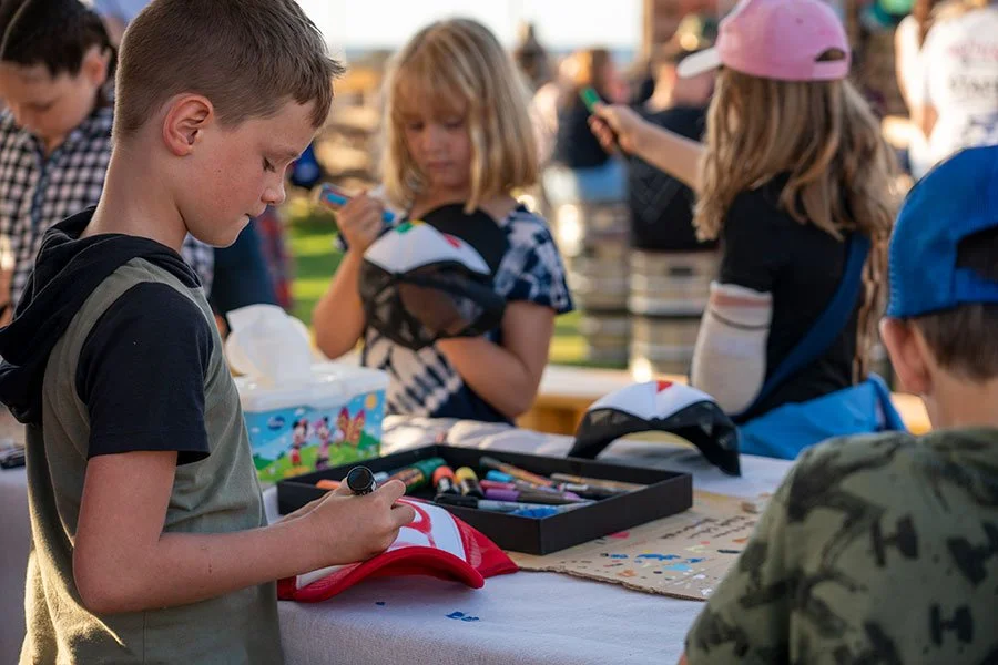
Beachside Painting Workshops for Fringe Festival
The City of Stirling approached me to run custom 'drop-in' trucker painting workshops at the stunning Sunset Veranda during the Fringe World Festival. This free activity aimed to kids, parents, and other festival goers.
Over the course of the festival, we facilitated multiple three-hour drop-in workshops. People of all ages showed up eager to customise their very own trucker caps. Each participant could choose from four different coloured caps, and we supplied all the paint pens and pencils needed to turn a blank canvas into something truly special.
The concept was designed to be laid-back and accessible. With the drop-in style, we could accommodate up to 50 people in just two hours, which meant we could include as many participants as possible throughout the day. It also meant that we could cater to different age groups and attention spans.
What I loved the most was seeing the creativity flow, especially when the kids realised they could create their very own piece of wearable art. It was amazing to watch them get absorbed in the painting process, knowing that they would walk away with something they could wear with pride. The joy on their faces when they finished their caps—some even proudly rocking them to school after—was priceless.
For those who wanted to get even more creative, we allowed participants to bring along their surfboards or skateboards, providing an opportunity for them to paint on their own gear.
All in all, the workshops were a huge success. They offered a free, engaging activity for festival-goers that brought the community together in a way that felt relaxed and creative. Seeing people of all ages come together to express their own style through art—whether on a cap, board, or just on paper—displayed the spirit of Perth Fridge - creativity without borders.


Collaborative Student-Led Murals at Safety Bay Senior High
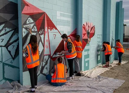
I was invited to facilitate two student-assisted murals in collaboration with Safety Bay Senior High School. The aim was to beautify the school and engage students in a creative process. The first mural, created for the school’s 40th Anniversary, and the second, promoting ‘The Arts,’ were painted with the help of selected Year 8 to 10 students and art teacher Tracey Sharpe.
The process started with a brainstorming workshop where I guided the students in developing ideas for the mural. Using their input, I created a professional concept that was approved by the school. A second workshop focused on skills development, where I taught painting techniques to help the students gain confidence before the final full-day painting session. The students brought the walls to life, and Tracey and I finished the murals to a professional standard the following day.
Every project I take on is an opportunity to push creative boundaries and bring a little more art into the world. Whether it's a community focused mural or a large scale corporate piece, my goal is always to create something that tells a story and makes an impact.


Huge (30M) Mural for Stockland Bull Creek Shopping Centre
I recently had the opportunity to be the chief facilitator and muralist for a project that brought together creativity, community, and local culture. Stockland Bull Creek Shopping Centre commissioned me to create a mural on a massive 30-meter exterior wall, and what made it even more exciting was the involvement of a talented group of Year 11 students from Melville Senior High.
The mural needed to reflect the natural surroundings of the area while using bright colors and an eye-catching narrative. After brainstorming with the students, two inspiring art teachers—Ali Blackwell and Jenna Antoniolli—joined the team, and together we developed a design that reflected the local environment in a meaningful way.

I recently had the opportunity to be the chief facilitator and muralist for a project that brought together creativity, community, and local culture. Stockland Bull Creek Shopping Centre commissioned me to create a mural on a massive 30-meter exterior wall, with the involvement of a talented group of Year 11 students from Melville Senior High.
The mural needed to reflect the natural surroundings of the area while using bright colors and an eye-catching narrative. After brainstorming with the students, two inspiring art teachers—Ali Blackwell and Jenna Antoniolli—joined the team, and together we developed a design that reflected the local environment in a meaningful way.
The theme explored the Nyoongar seasonal calendar, bringing the area’s connection to nature front and centre. The mural features local bird species like the crow, galah, and ibis, painted in vibrant detail. My role was to bring these birds to life, working alongside the students who contributed their skills in patterning and design.
The whole process was a blast. We kicked off with an ideas-building workshop at the school, where I shared techniques and creative concepts with the Year 11 students. Then, over three days, we worked together to transform the blank wall into a work of art. Watching the students take ownership of the project while learning along the way was incredibly rewarding.
This project really showcased how shopping centres like Stockland Bull Creek can not only enrich their environment and connect with the local community through collaborative art.


