

Retro Roots & Suburban Boots
Fieldey’s newest mural, Retro Roots & Suburban Boots, is a love letter to the working-class charm of Perth’s northern suburbs from the 1970s through to the 1990s. With Retro Roots & Suburban Boots, Fieldey offers a vibrant, layered response to place—celebrating the working-class identity and rich suburban culture of Perth’s northern suburbs from the 1970s through to the 1990s. Situated in Craigie, where the artist first settled after moving to Perth, the mural interweaves personal narrative with community-sourced memories to tell a collective story of time and belonging.
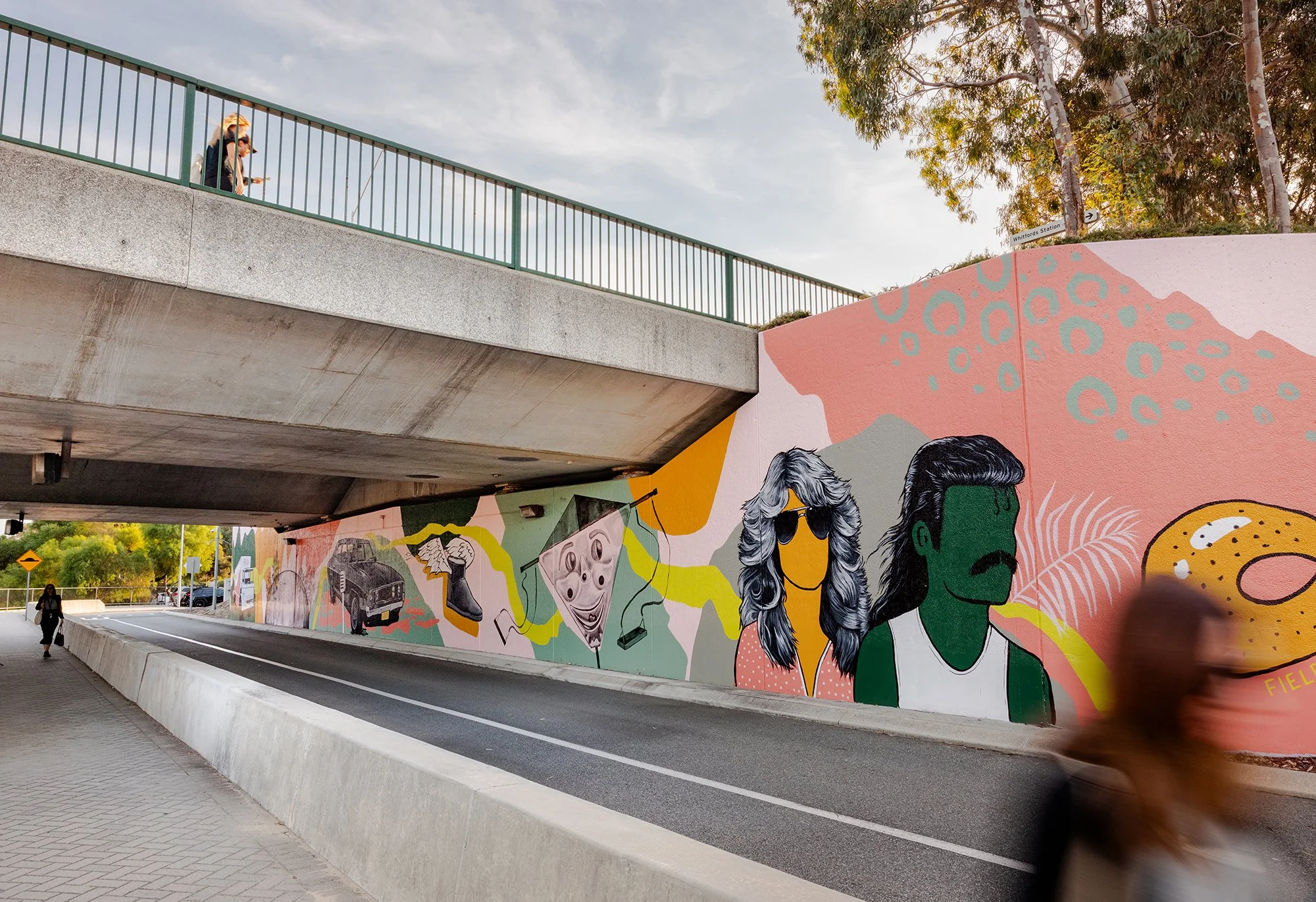
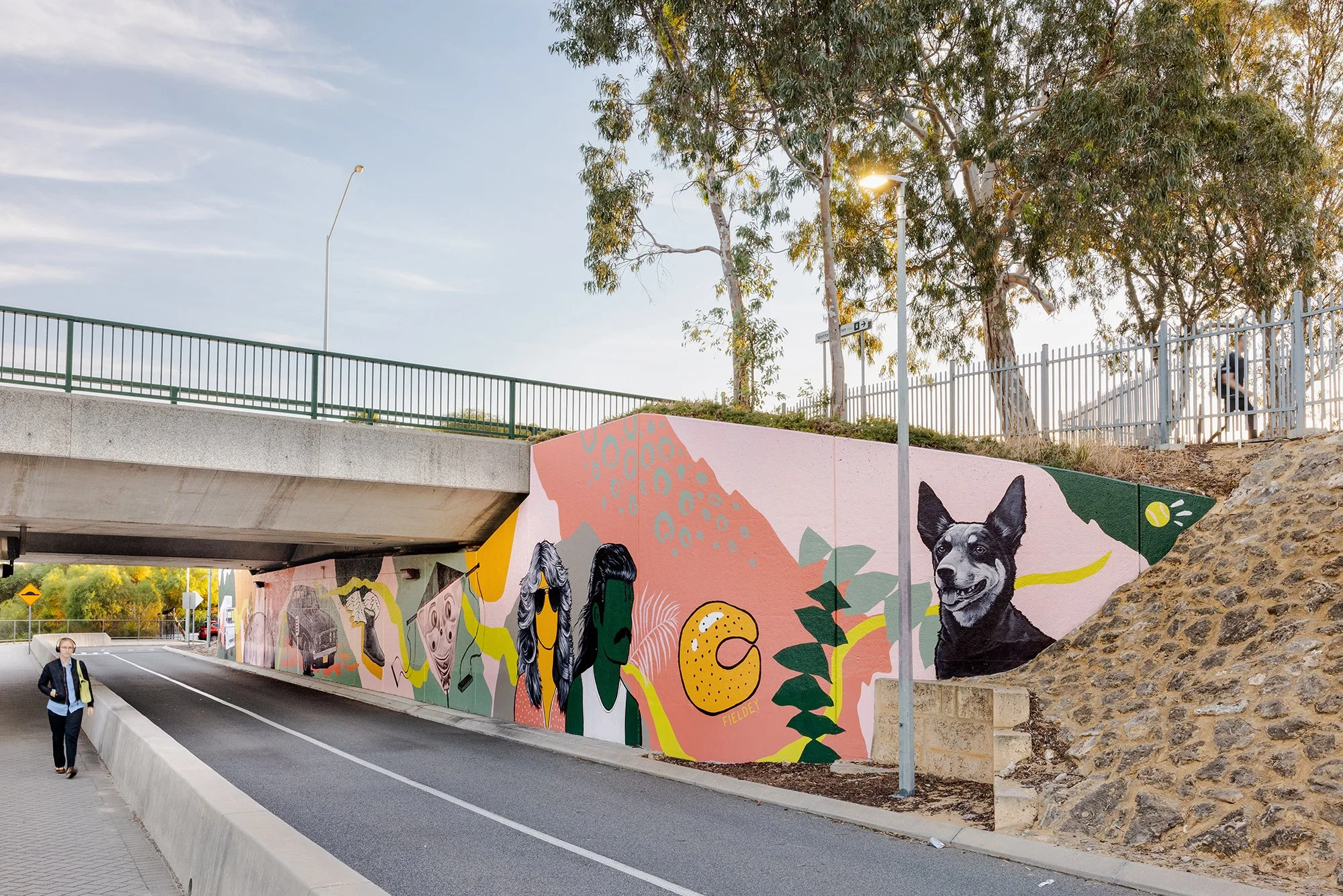
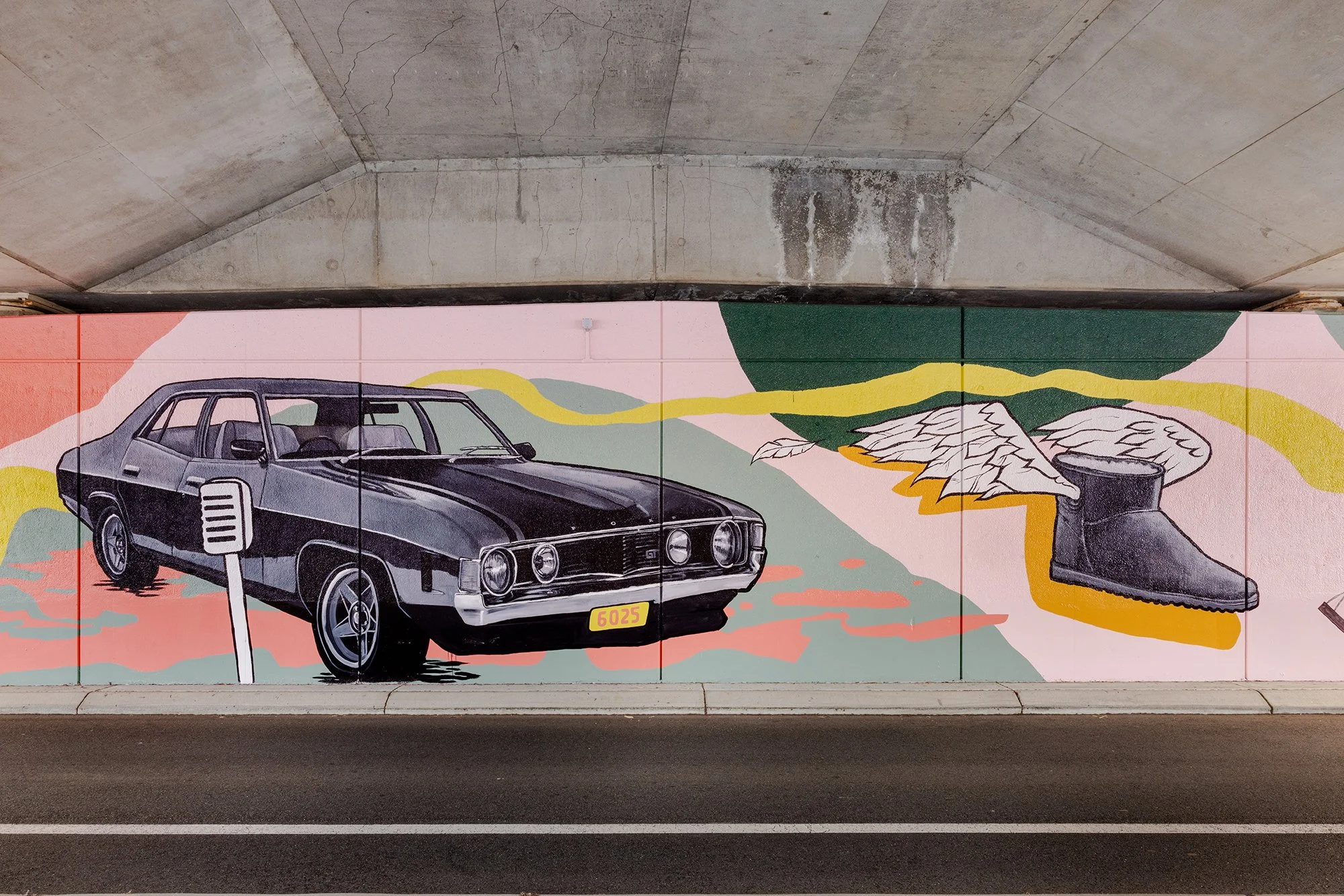
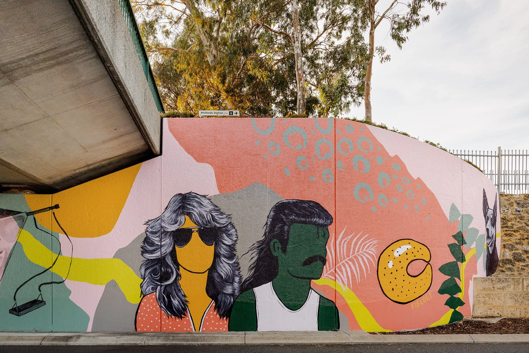
The design centres on a retro-themed drive-in movie scene, where a couple (complete with resplendent mullet and Farrah Fawcett waves) enjoy a date night with their beloved Kelpie and choc-milk in tow. It’s a loving nod to classic car culture, iconic hairstyles, and the all-terrain status of Ugg boots—details drawn directly from Fieldey's own experience of life in Craigie.
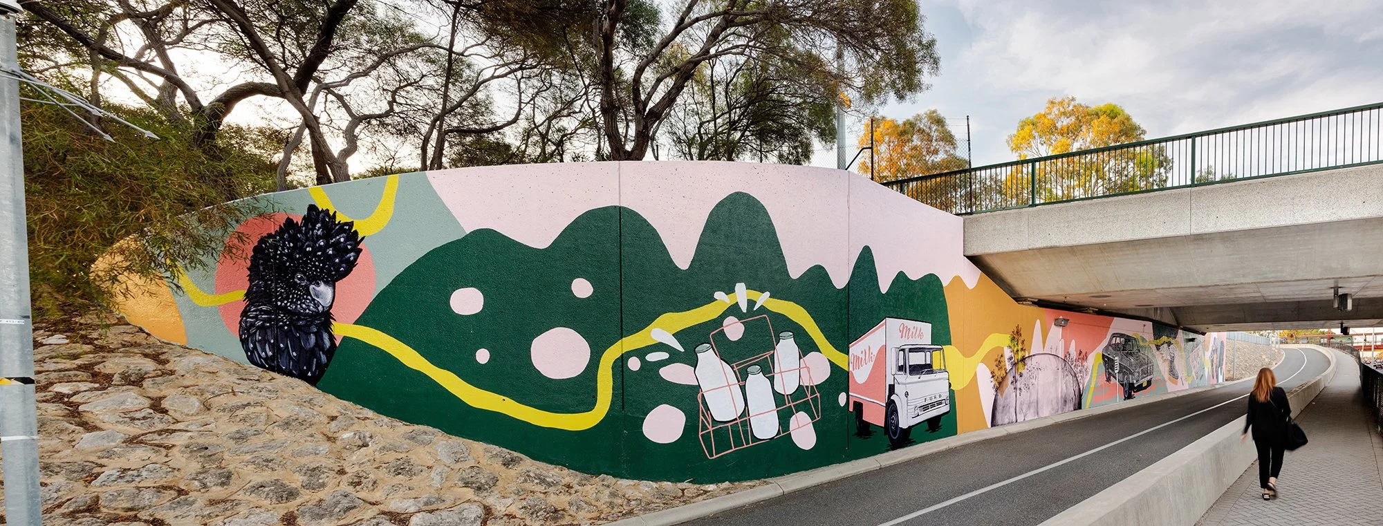
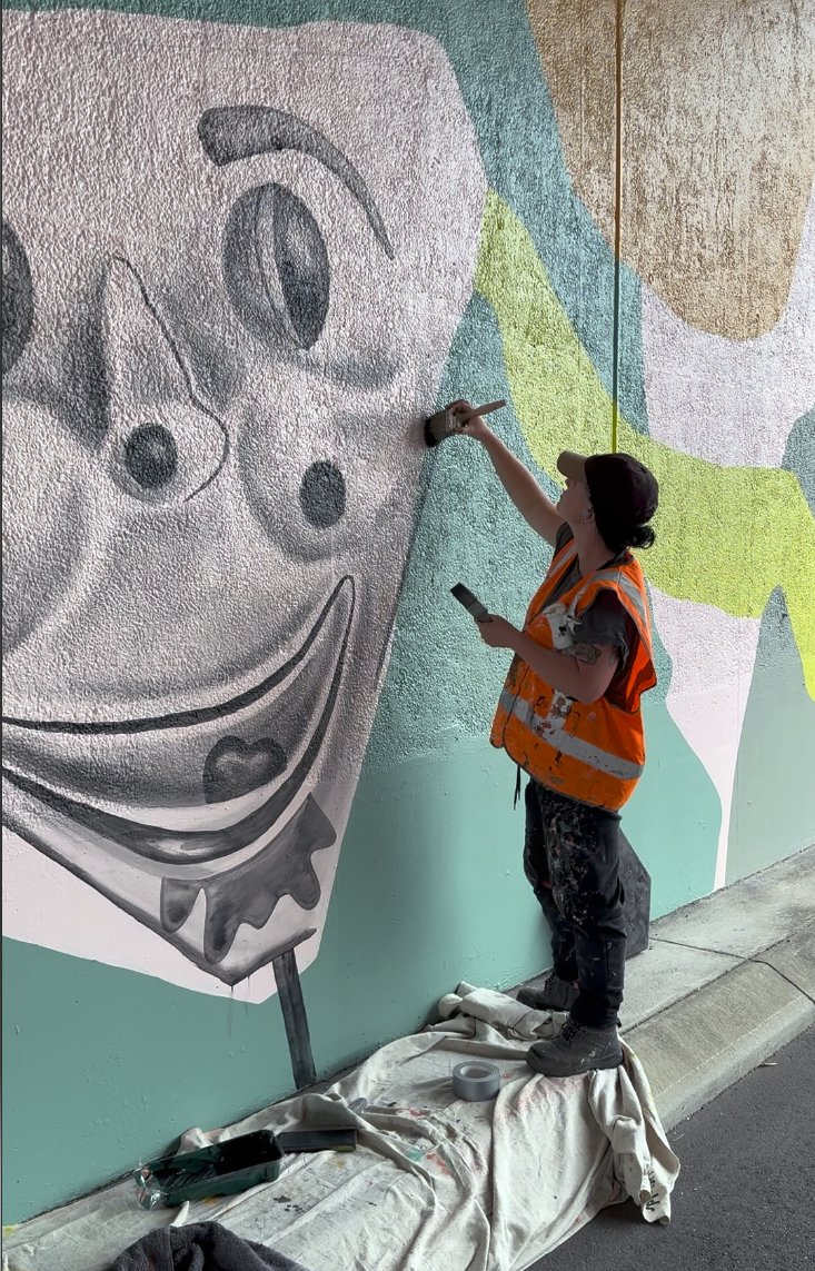
The creative process behind the mural was equally rooted in community connection. Fieldey reached out to residents via local Facebook groups, inviting them to share their memories of growing up in the area. The nostalgic and often hilarious responses inspired many of the mural’s key features: home milk deliveries, horse-shoe rolls, the Binishell dome, black cockatoos and banksias, and even the infamous creepy clown swing. These stories were lovingly woven into the composition, ensuring the final piece feels both personal and collective.
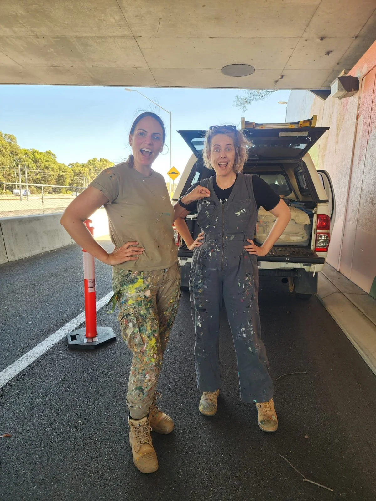
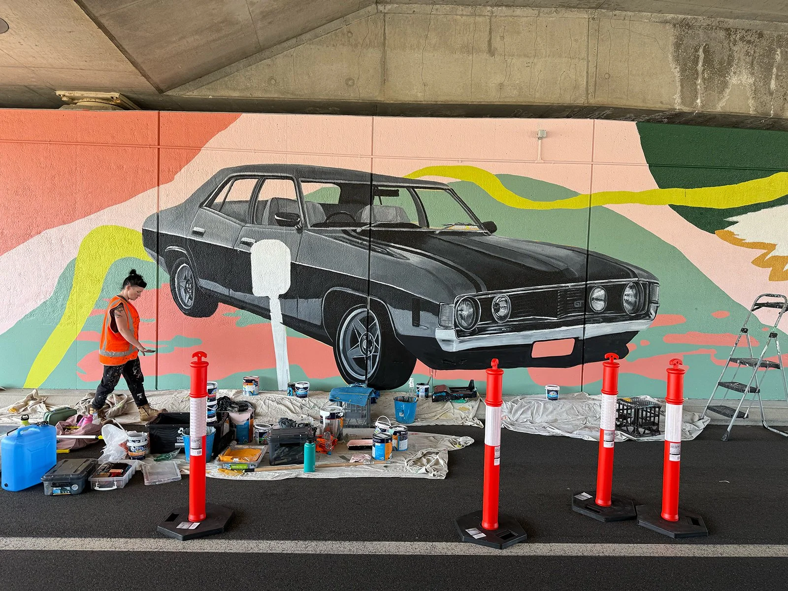
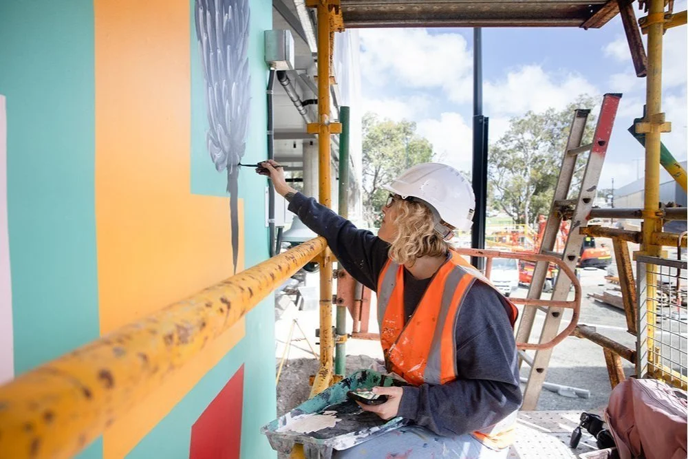
A team of three artists joined Fieldey to bring the mural to life over six days of painting. Together, they transformed the site into a flowing visual narrative that embraces the curve of the wall and is visible from both the freeway and nearby carpark. A dynamic green line snakes through the composition, connecting each element and referencing both physical travel and the deeper idea of intergenerational connection. The artwork’s bright, retro-inspired palette was developed from the Main Roads colour schemes for Hepburn to Whitfords and Whitfords to Ocean Reef, with a splash of bold pink added to modernise and unify the work.
True to its name, Retro Roots & Suburban Boots is more than a nostalgic throwback—it’s a reflection on how much has changed, and how much remains. Classic cars still cruise the streets, mullets have made their comeback, and Ugg boots are as essential as ever. The mural captures that sense of enduring identity, playfulness and local pride with boldness, humour and heart.
Retro Roots & Suburban Boots is Fieldey’s newest mural, a nostalgic love letter to the working-class charm of Perth’s northern suburbs from the 1970s through the 1990s. Painted in Craigie, where Fieldey first landed after moving to Perth, the artwork blends personal memories with stories gathered from the local community to create a lively portrait of suburban life.
At the centre of the design is a retro drive-in movie scene: a couple on date night, complete with a glorious mullet, Farrah Fawcett waves, a loyal Kelpie and a choc-milk on hand. It is a playful nod to classic car culture, iconic hairstyles and the everyday comforts like trusty Ugg boots that defined life in Craigie during that era.
The mural’s details were shaped by the community itself. Fieldey reached out to residents through local Facebook groups, inviting them to share their favourite stories from growing up in the area. Their memories, funny, heartfelt and wonderfully specific, inspired many of the mural’s elements, including home milk deliveries, horse-shoe rolls, the Binishell dome, black cockatoos and banksias, and even the infamous creepy clown swing. These slices of local history were woven throughout the composition so the artwork feels both deeply personal and unmistakably Craigie.
The mural was brought to life by a team of three artists over six days of painting. Together, they transformed the curved wall into a flowing visual narrative visible from both the freeway and the nearby carpark. A sweeping green line travels through the artwork, linking each vignette and symbolising both physical movement and intergenerational connection. The retro-inspired palette draws from Main Roads colour schemes for Hepburn to Whitfords and Whitfords to Ocean Reef, with an added hit of bold pink to freshen and unify the design.
True to its name, Retro Roots & Suburban Boots is not just a nostalgic throwback. It is a celebration of what gives the northern suburbs their character. Some things have changed, but many have not. Classic cars still roam, mullets are back and Ugg boots remain essential. The mural captures that enduring sense of place with humour, colour and heart.

Morley Station Carpark
I was thrilled to win the tender to create a major public artwork for the Morley Station carpark as part of the METRONET project. My concept was selected because of its strong connection to Morley – it referenced iconic institutions and shared experiences from the past 40 years. I wanted the work to create a sense of continuity between the well-established, historical side of Morley and the new, modern space of the train station and its surrounds.
The final artwork was made up of three main areas: a blade wall, a series of perforated screens, and the level 1 balustrade wall. Together, they formed a bold, modern statement that helped shape the arrival and departure experience in a meaningful way.
The blade wall featured the word "Morley" in large, colourful, overlapping letters – a visual reference to the classic Morley Markets font. I included abstract patterns inspired by local history, with nods to the old Boans department store and architectural designs from the area. I also created detailed black-and-white illustrations of curry leaves, olives, dragon fruit and bananas, which tied into the perforated screens nearby.
The perforated screen artwork wrapped around the carpark and offered a modern-retro take on Morley’s past and present. I focused on edible plants as a visual motif, to reflect the influence of Morley’s multicultural communities and how they’ve shaped the local environment and culture.
The level 1 balustrade wall was where I really got to lean into the nostalgia. I combined archival images with playful, colourful references to local culture – starting with the old Boans department store and moving through scenes featuring the Morley Seal sculptures, the Wirrina Drive-In Theatre, and the much-loved Morley Rollerdrome. It was also important for me to acknowledge the area’s Italian and Asian communities, so I included details and colour palettes that spoke to those cultural influences.
This project was a joy to work on – not only because it allowed me to explore Morley’s rich history, but because it reminded me of the power public art has to connect people to place. I hope the finished work brings a sense of pride and recognition to the local community, while welcoming new visitors with a bold and colourful snapshot of what makes Morley unique.


