

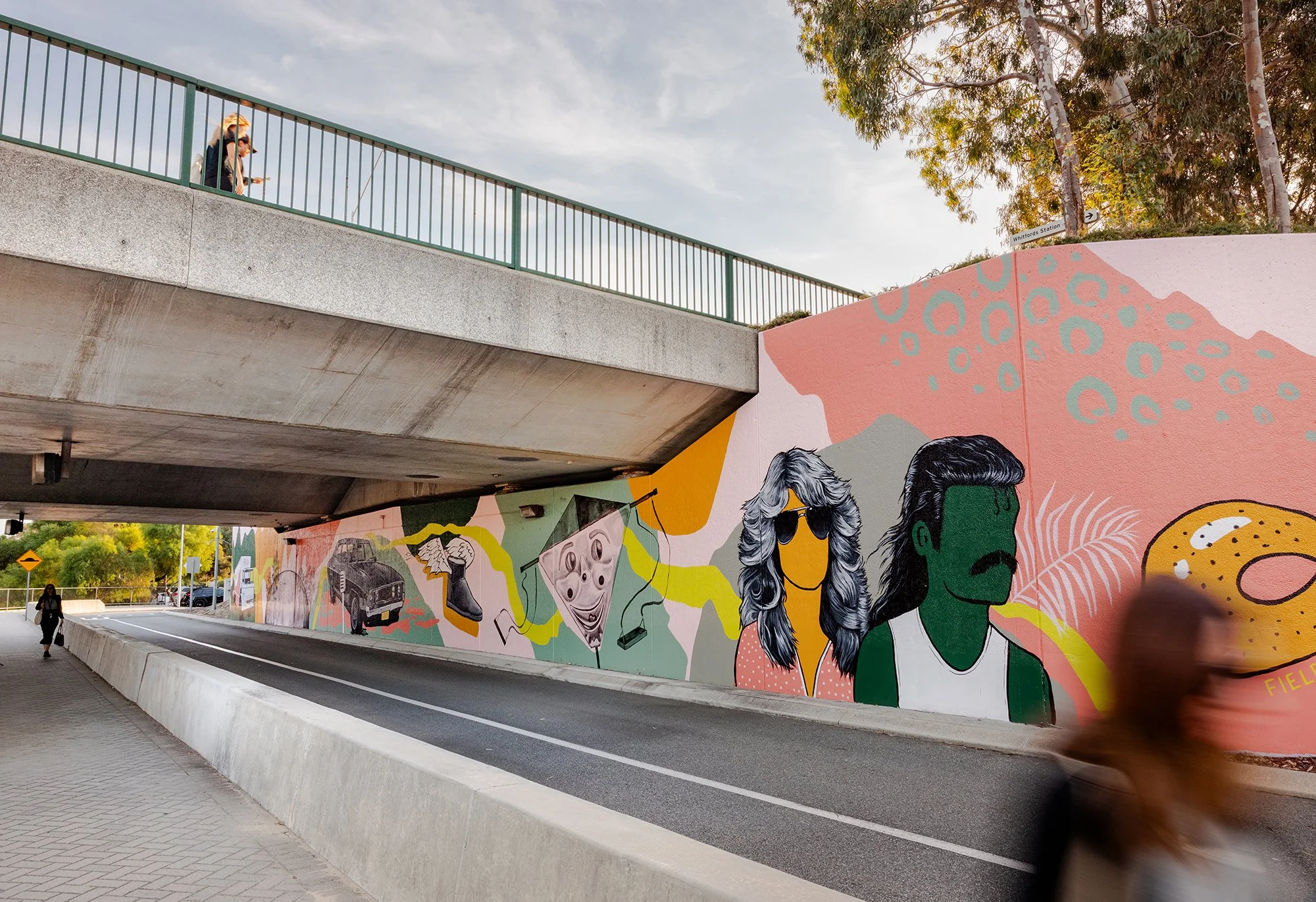
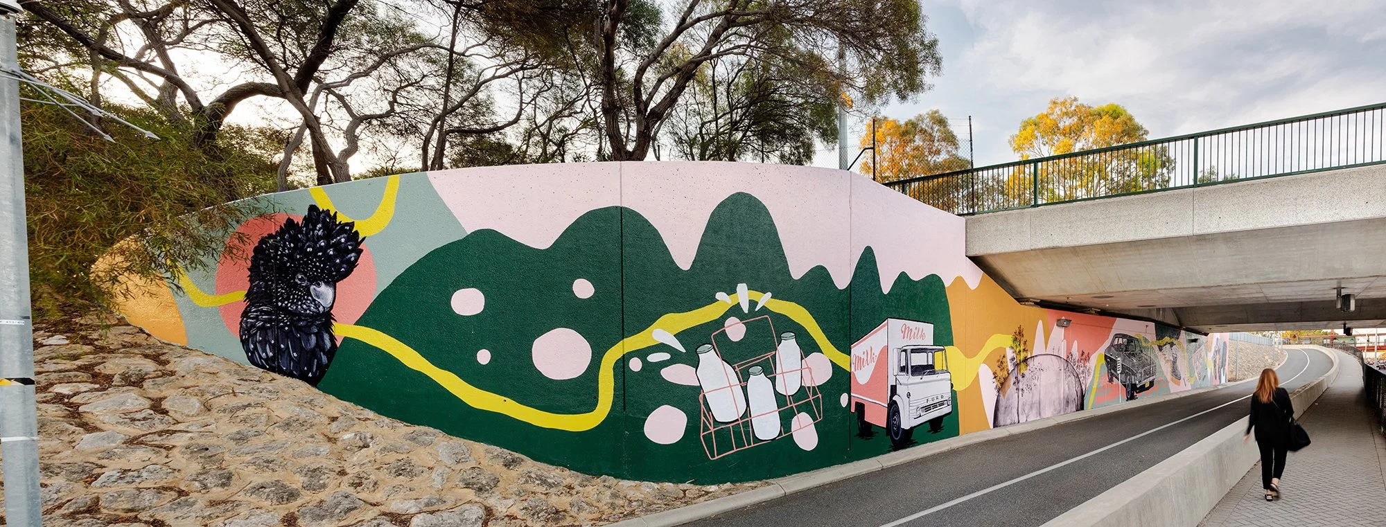
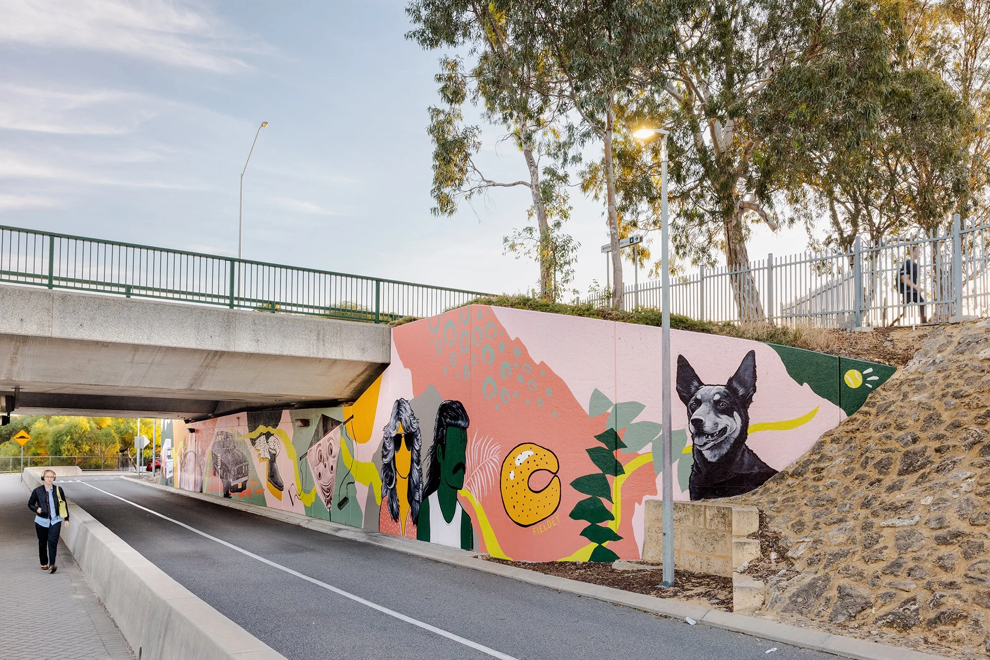
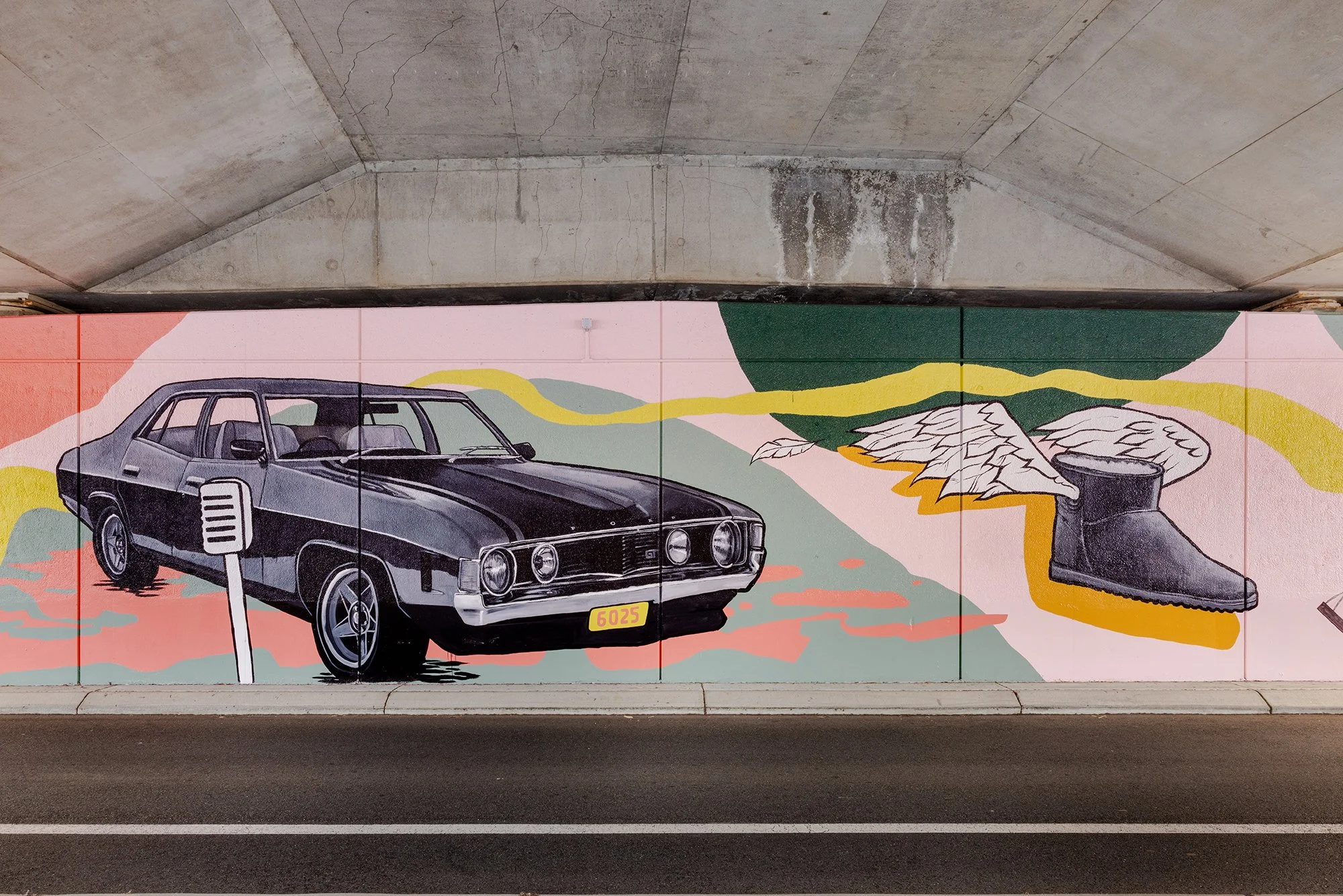
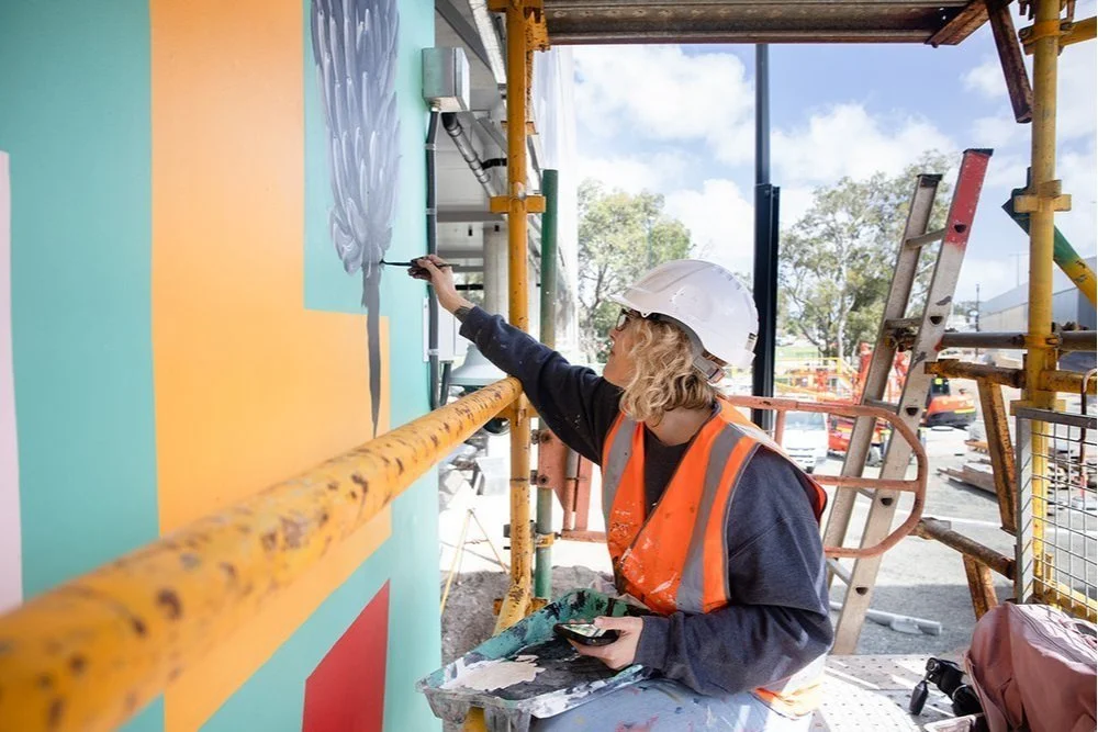
Retro Roots & Suburban Boots
Fieldey’s newest mural, Retro Roots & Suburban Boots, is a love letter to the working-class charm of Perth’s northern suburbs from the 1970s through to the 1990s. With Retro Roots & Suburban Boots, Fieldey offers a vibrant, layered response to place—celebrating the working-class identity and rich suburban culture of Perth’s northern suburbs from the 1970s through to the 1990s. Situated in Craigie, where the artist first settled after moving to Perth, the mural interweaves personal narrative with community-sourced memories to tell a collective story of time and belonging.
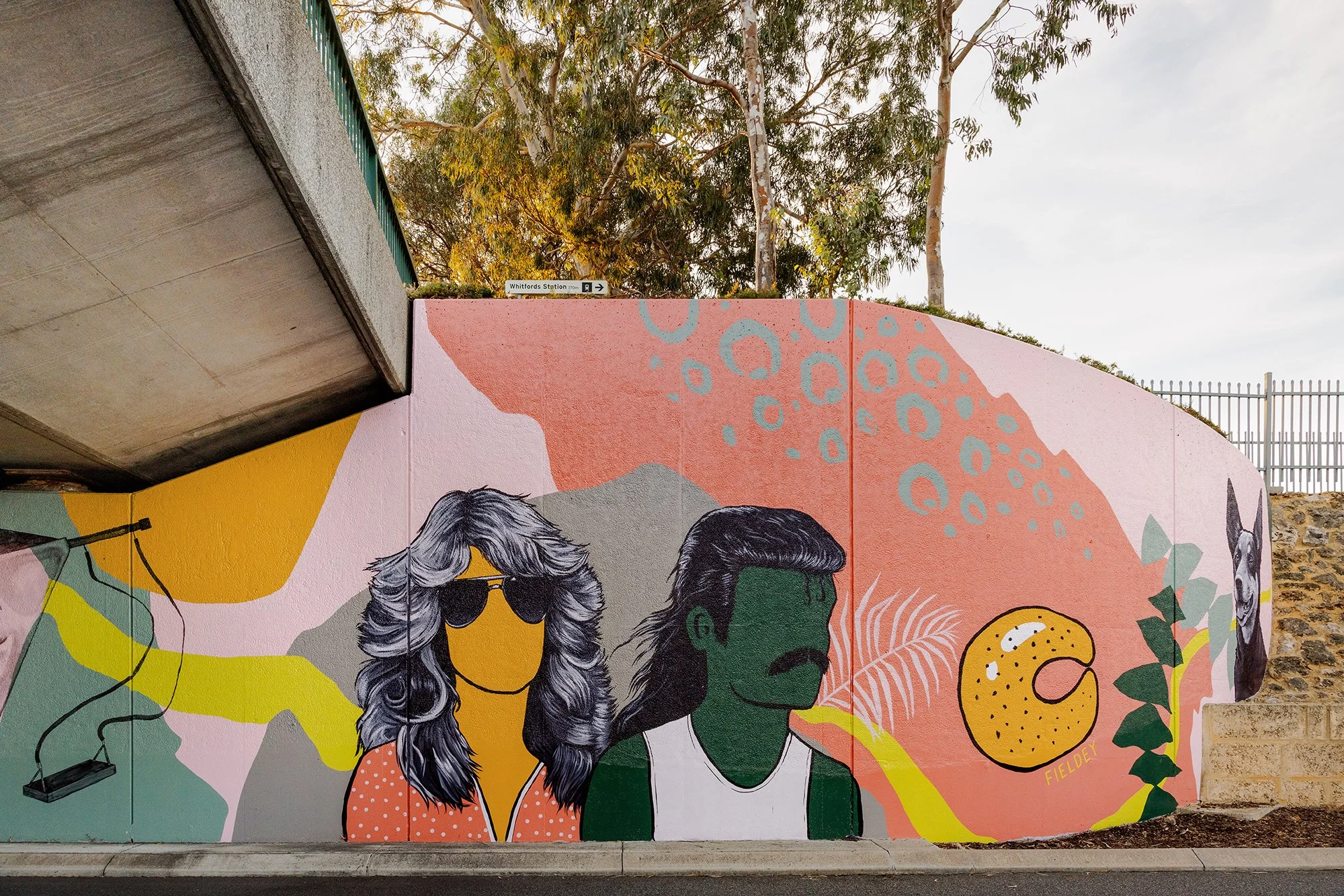
The design centres on a retro-themed drive-in movie scene, where a couple (complete with resplendent mullet and Farrah Fawcett waves) enjoy a date night with their beloved Kelpie and choc-milk in tow. It’s a loving nod to classic car culture, iconic hairstyles, and the all-terrain status of Ugg boots—details drawn directly from Fieldey's own experience of life in Craigie.
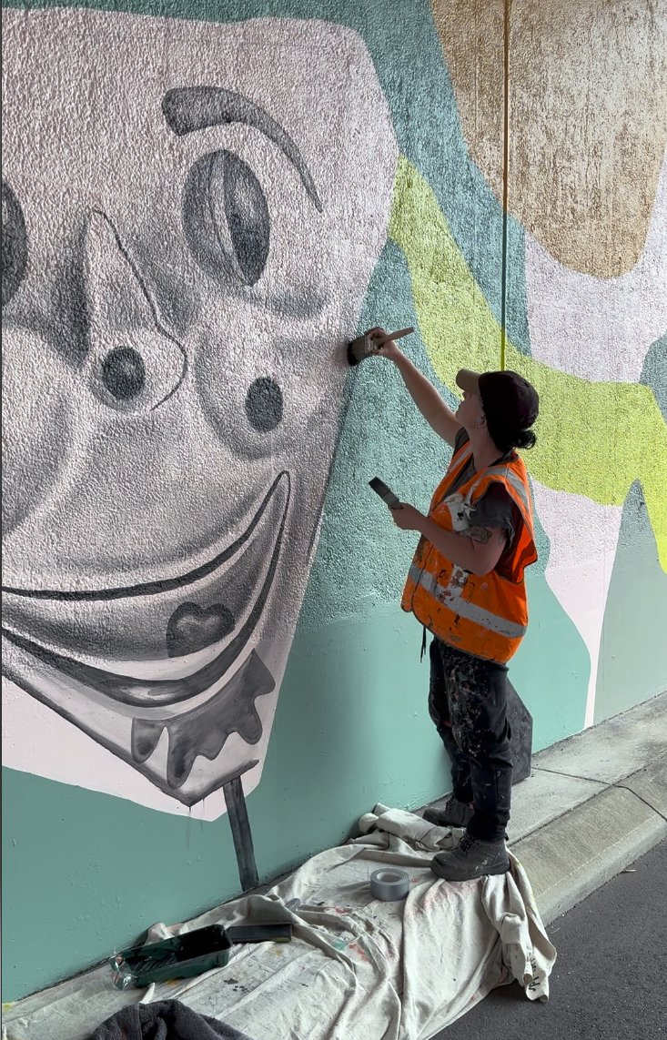
The creative process behind the mural was equally rooted in community connection. Fieldey reached out to residents via local Facebook groups, inviting them to share their memories of growing up in the area. The nostalgic and often hilarious responses inspired many of the mural’s key features: home milk deliveries, horse-shoe rolls, the Binishell dome, black cockatoos and banksias, and even the infamous creepy clown swing. These stories were lovingly woven into the composition, ensuring the final piece feels both personal and collective.
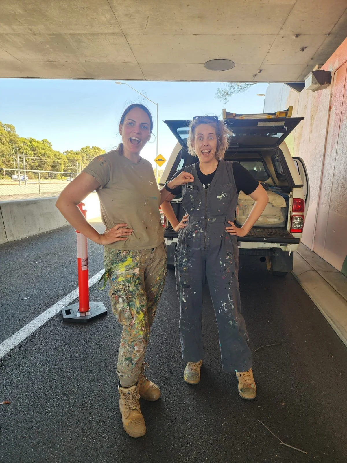
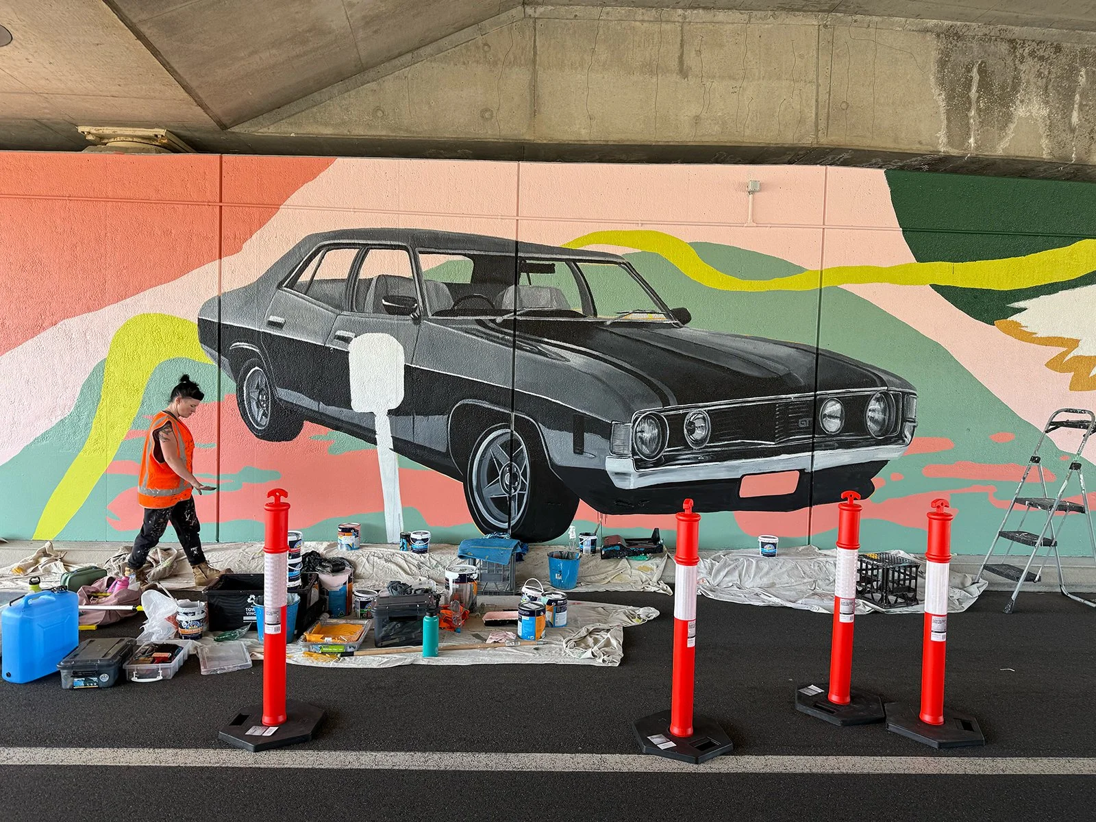
A team of three artists joined Fieldey to bring the mural to life over six days of painting. Together, they transformed the site into a flowing visual narrative that embraces the curve of the wall and is visible from both the freeway and nearby carpark. A dynamic green line snakes through the composition, connecting each element and referencing both physical travel and the deeper idea of intergenerational connection. The artwork’s bright, retro-inspired palette was developed from the Main Roads colour schemes for Hepburn to Whitfords and Whitfords to Ocean Reef, with a splash of bold pink added to modernise and unify the work.
True to its name, Retro Roots & Suburban Boots is more than a nostalgic throwback—it’s a reflection on how much has changed, and how much remains. Classic cars still cruise the streets, mullets have made their comeback, and Ugg boots are as essential as ever. The mural captures that sense of enduring identity, playfulness and local pride with boldness, humour and heart.
Retro Roots & Suburban Boots is Fieldey’s newest mural, a nostalgic love letter to the working-class charm of Perth’s northern suburbs from the 1970s through the 1990s. Painted in Craigie, where Fieldey first landed after moving to Perth, the artwork blends personal memories with stories gathered from the local community to create a lively portrait of suburban life.
At the centre of the design is a retro drive-in movie scene: a couple on date night, complete with a glorious mullet, Farrah Fawcett waves, a loyal Kelpie and a choc-milk on hand. It is a playful nod to classic car culture, iconic hairstyles and the everyday comforts like trusty Ugg boots that defined life in Craigie during that era.
The mural’s details were shaped by the community itself. Fieldey reached out to residents through local Facebook groups, inviting them to share their favourite stories from growing up in the area. Their memories, funny, heartfelt and wonderfully specific, inspired many of the mural’s elements, including home milk deliveries, horse-shoe rolls, the Binishell dome, black cockatoos and banksias, and even the infamous creepy clown swing. These slices of local history were woven throughout the composition so the artwork feels both deeply personal and unmistakably Craigie.
The mural was brought to life by a team of three artists over six days of painting. Together, they transformed the curved wall into a flowing visual narrative visible from both the freeway and the nearby carpark. A sweeping green line travels through the artwork, linking each vignette and symbolising both physical movement and intergenerational connection. The retro-inspired palette draws from Main Roads colour schemes for Hepburn to Whitfords and Whitfords to Ocean Reef, with an added hit of bold pink to freshen and unify the design.
True to its name, Retro Roots & Suburban Boots is not just a nostalgic throwback. It is a celebration of what gives the northern suburbs their character. Some things have changed, but many have not. Classic cars still roam, mullets are back and Ugg boots remain essential. The mural captures that enduring sense of place with humour, colour and heart.

Morley Station Carpark
I was thrilled to win the tender to create a major public artwork for the Morley Station carpark as part of the METRONET project. My concept was selected because of its strong connection to Morley – it referenced iconic institutions and shared experiences from the past 40 years. I wanted the work to create a sense of continuity between the well-established, historical side of Morley and the new, modern space of the train station and its surrounds.
The final artwork was made up of three main areas: a blade wall, a series of perforated screens, and the level 1 balustrade wall. Together, they formed a bold, modern statement that helped shape the arrival and departure experience in a meaningful way.
The blade wall featured the word "Morley" in large, colourful, overlapping letters – a visual reference to the classic Morley Markets font. I included abstract patterns inspired by local history, with nods to the old Boans department store and architectural designs from the area. I also created detailed black-and-white illustrations of curry leaves, olives, dragon fruit and bananas, which tied into the perforated screens nearby.
The perforated screen artwork wrapped around the carpark and offered a modern-retro take on Morley’s past and present. I focused on edible plants as a visual motif, to reflect the influence of Morley’s multicultural communities and how they’ve shaped the local environment and culture.
The level 1 balustrade wall was where I really got to lean into the nostalgia. I combined archival images with playful, colourful references to local culture – starting with the old Boans department store and moving through scenes featuring the Morley Seal sculptures, the Wirrina Drive-In Theatre, and the much-loved Morley Rollerdrome. It was also important for me to acknowledge the area’s Italian and Asian communities, so I included details and colour palettes that spoke to those cultural influences.
This project was a joy to work on – not only because it allowed me to explore Morley’s rich history, but because it reminded me of the power public art has to connect people to place. I hope the finished work brings a sense of pride and recognition to the local community, while welcoming new visitors with a bold and colourful snapshot of what makes Morley unique.


Mural for South Coast Baptist College
I was commissioned by South Coast Baptist College to create a student-assisted mural that would serve as both a visual representation of the school’s identity and a celebration of its sporting culture. The brief required the incorporation of the school’s colours, the animals representing the four sports houses, and a verse that aligned with the school’s values.
To initiate the project, I conducted a concept-building workshop with Year 10 art students. This session allowed the students to actively engage in the creative process, sharing their ideas and perspectives on what the mural should represent. Their input was instrumental in shaping the direction of the design, ensuring that the final artwork would be a true reflection of the school community.
The design I developed incorporated the school colours and featured the four sporting house animals, each carefully integrated into the composition to reflect the unique characteristics of the houses and their respective students. The use of bold, vibrant colours helped to create a dynamic and engaging visual, while the animals were positioned in a way that symbolised both the individuality of each house and their collective unity.
The chosen verse was seamlessly woven into the design, reinforcing the values of the school and adding a layer of meaning to the artwork. This thoughtful inclusion ensured that the mural was not only visually striking but also resonated with the students and staff on a deeper level.
A key aspect of this project was the active involvement of the students in the mural’s execution. Throughout the painting process, the Year 10 students had the opportunity to contribute directly to the artwork, allowing them to take ownership of the mural and deepen their connection to the finished piece. This collaboration resulted in a mural that is not only a testament to the school’s spirit but also a reflection of the students’ creativity and commitment.
The completed mural now stands as a vibrant and meaningful addition to South Coast Baptist College, embodying the school’s values, celebrating its sporting achievements, and showcasing the collaborative effort that went into its creation. It was a privilege to work alongside the students and staff, and the mural will undoubtedly continue to inspire pride and community for years to come.


Community Mural for Weeip Park Development
As an artist, I believe in the power of art to foster community identity and engagement. The Weeip Park Community Art Mural was a project designed to do just that—creating a vibrant landmark for the Weeip Park Youth Space while involving the young people of Midland to take part as active stakeholders in their own community.
To ensure the mural reflected the voices and experiences of the local youth, I conducted five youth engagement brainstorming sessions and a dedicated workshop. These sessions were designed to gather a diverse range of ideas and stories, ensuring the final artwork was both meaningful and representative of the community. Additionally, drawing on my experience as a YouTube creator, I developed a custom video to promote the project—meeting young people on a platform they use and identify with.
A major theme of the mural is connection—both in the literal sense of Midland’s role as a transport hub and in the way young people come together in shared spaces. The design features colourful squares and shapes that form a semi-realistic map of Midland, highlighting key locations such as schools and Midland Gate. These elements were designed to be accessible for all skill levels, allowing participants to contribute during six community painting days that I facilitated.
Complementing this dynamic map are personal stories and memories, expressed through realistic black-and-white imagery and accompanying text. These contributions, provided by individual young people, create a story trail that visitors can follow throughout the park. The result is a mural that not only enhances the space visually but also serves as a testament to the significance of creative arts in building community and offering young people a sense of belonging and purpose.
This project exemplifies the role of art in shaping public spaces, fostering engagement, and demonstrating to the youth of Midland that creativity is a powerful tool for storytelling, connection, and professional opportunity. I am honoured to have been part of this initiative, and I look forward to seeing the impact it will continue to have on the community.


Pop-up Beatles Mural for Kaleidoscope Festival
I recently created a stunning pop-up mural paying tribute to The Beatles, as part of Joondalup’s Kaleidoscope Festival.
Taking inspiration from The Beatles' timeless legacy, I infused the piece with meticulous detail and lifelike representation, capturing the essence of each band member. The artwork served as both a nostalgic homage and a modern interpretation, seamlessly blending street art aesthetics with classic rock iconography.
I wanted to create something that captures the spirit of The Beatles and the energy of the Kaleidoscope Festival—bold, immersive, and full of life.
The pop-up nature of the mural made it a unique attraction, reinforcing the festival’s ethos of ephemeral, ever-changing artistic expression. As the festival wrapped up, the mural disappeared, leaving behind only memories and photographs—a fitting tribute to both the fleeting magic of live art and the timeless legacy of The Beatles.
The Kaleidoscope Festival once again proved itself as a premier event for immersive art experiences, and I was honored that my Beatles mural stood out as a festival highlight.


Mexican-Themed Nightclub Fit-Out
Entertainment Enterprises commissioned me to transform Paramount nightclub in Northbridge, Perth, into a vibrant Mexican-themed party venue: Señor Peppers. The brief was clear—bring the energy of a Dia de los Muertos (Day of the Dead) fiesta to life, with playful and eye-catching artwork that would complement the venue’s new identity.
I spent two weeks painting four massive interior walls during the re-fit construction phase. This was no small feat—large scaffolds became my new best friends as I tackled a particularly tricky 7m x 5m staircase wall, which was transformed into a lively scene of dancing skeletons.
Every brushstroke was carefully considered to align with the interior design and furnishings, ensuring that the murals blended seamlessly into the final aesthetic of the venue. Bold, dynamic colours set the stage for a space that radiated fun, energy, and a true Mexican party vibe.
To capture the spirit of the project, I created a fun ‘making of’ video for Señor Peppers, giving people a behind-the-scenes look at the creative process. This became a fantastic way for the venue to engage with their audience on social media, building excitement before the grand opening.
The end result was a visually striking venue filled with colour, character, and an unmistakable fiesta atmosphere. Seeing my work become an integral part of Señor Peppers was incredibly rewarding, and I couldn’t have been happier to bring this vision to life.
¡Viva la fiesta!