|
Client: Town of Cambridge
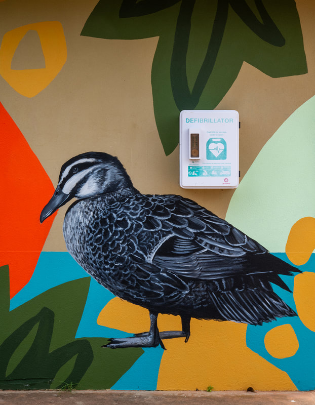
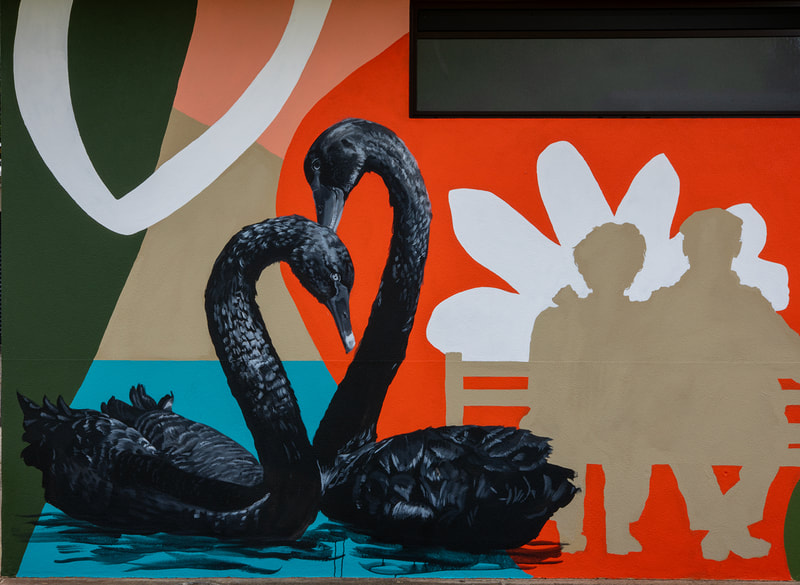
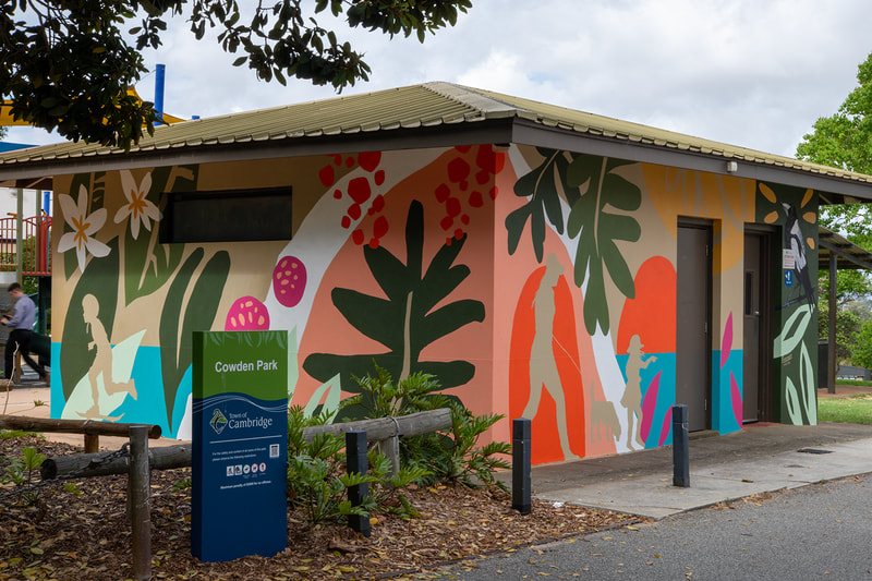
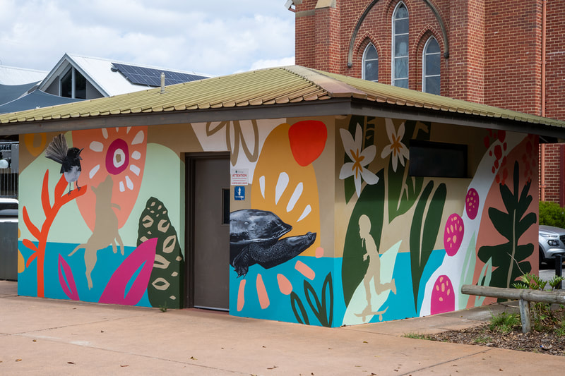
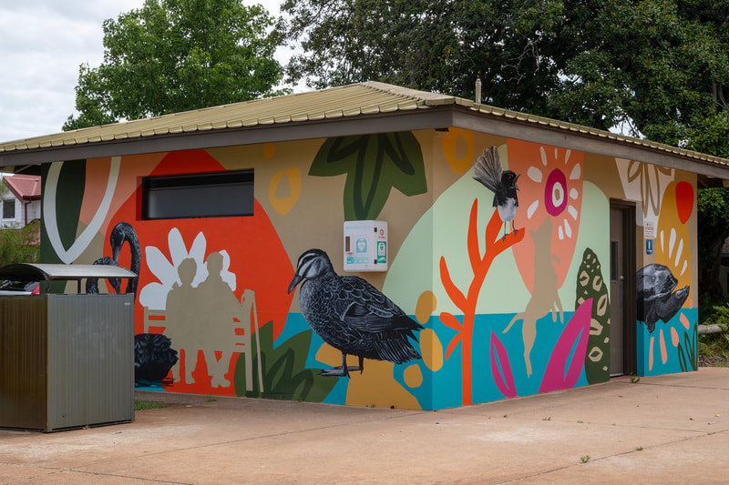
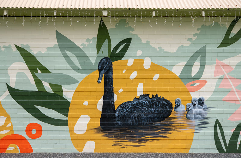
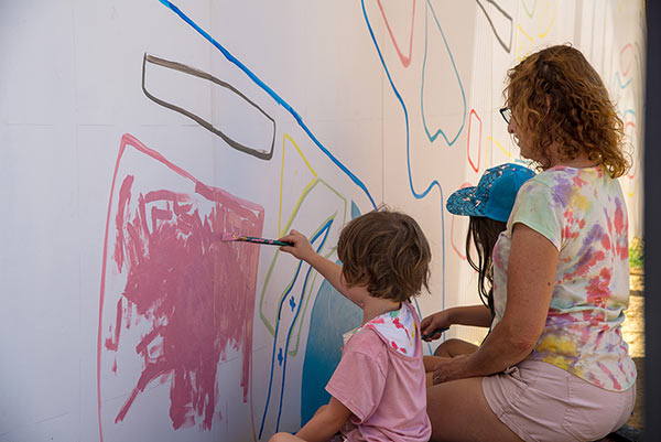
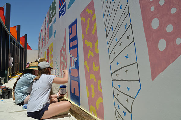
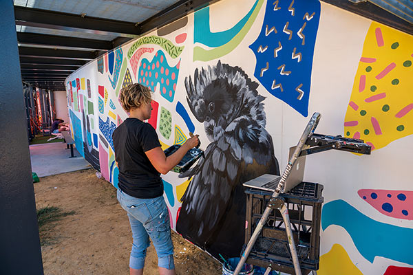
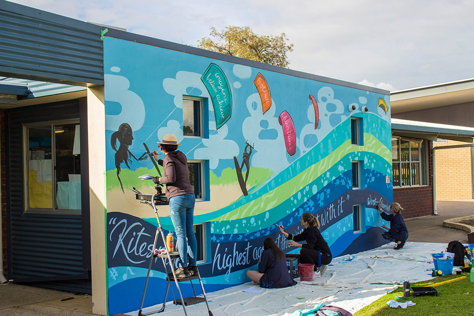
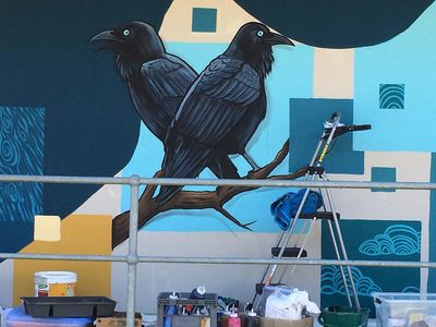
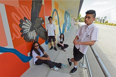
When: November 2023 Brief: This work was an EOI tender and the brief was to create a new look for the Cowden Park toilet block, involving the students of nearby West Leederville Primary School. Outcome: I did an initial concept-building workshop with a group of students at West Leederville Primary School. The students brainstormed ideas around the theme "Celebrating the beauty of our area", coming up with ideas that I could include in the mural. I took their ideas and created a fun and vibrant design that wraps around the building, utilising areas of the original colour to link it back in with it's surroundings. The concept features a blue horizon line which represents Lake Monger. There are people shown as silhouettes utilising the walking and cycleways around the park. Native flora and fauna were incorporated into the design, Myself and my team, created "paint-by-numbers" outlines on the wall and the students came and had a painting day, helping to fill in all the flat colour areas on the wall. This was very well received by the students and they loved showing off "their bit" of the mural to friends and family. I painted in the realistic birds and animals and the whole piece was anti-graffiti coated. Client: Shire of Peppermint Grove
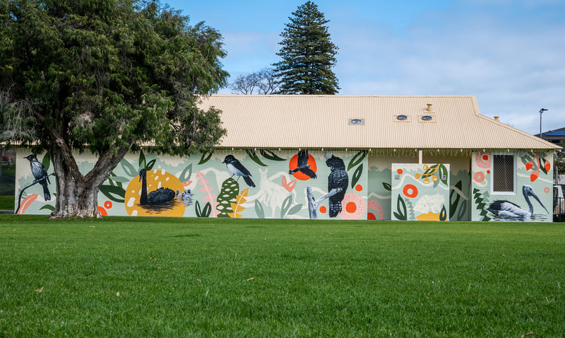
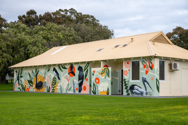
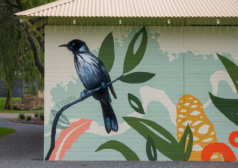
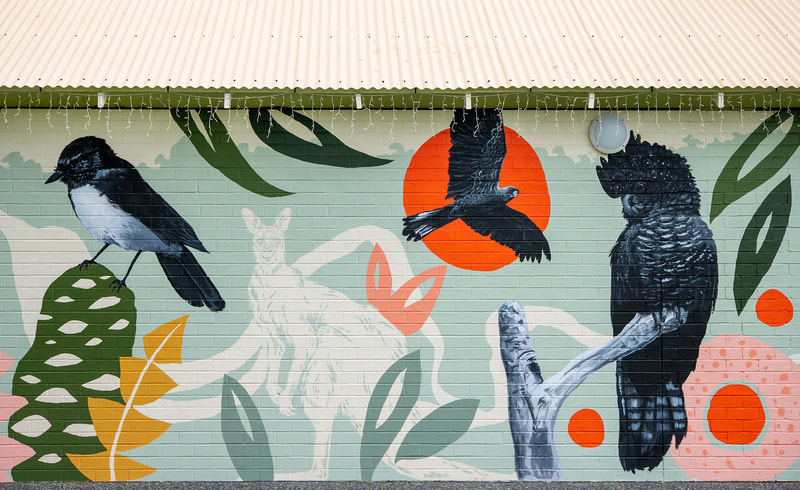
When: June 2023 Brief: This work was an EOI tender, consulted by FORM. This was to be Peppermint Groves' first mural and as such the design needed to fit within the leafy grounds of the park and not stand out too much. Outcome: I won the tender because of my high-quality concept and the stylish and contemporary look of the design that incorporated local flora and fauna in an understated and sympathetic way. Because this is the first mural that the Shire of Peppermint Grove has commissioned, I wanted to create a beautiful piece of art that would embrace the building and be sympathetic to its surroundings. I chose to use a modern Australian bush palette, with a bold feature colour to add a pop of colour and impact. The design utilises the original colour of the wall to help the artwork meld with the building. The artwork also contains no hard edges; it folds around either side of the building and around the toilet entry walls to utilise space effectively, and to gently harmonise with its surroundings. The mural was painted with a team of two assistants and took six days to paint. Client: City of Cockburn
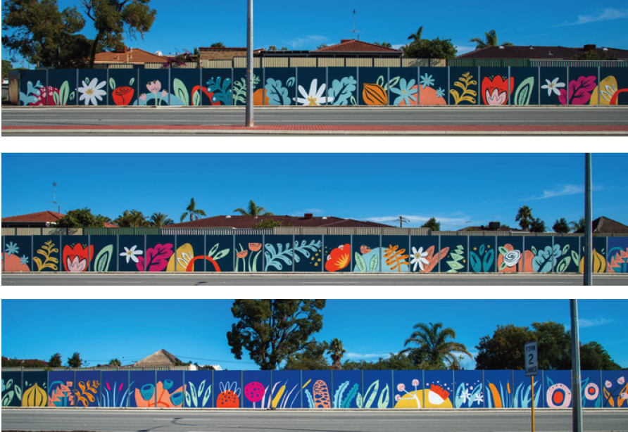
When: April 2023 Brief: The commission was by EOI process and the brief was to paint an 250m long noise wall on Spearwood Ave. The wall was originally painted a drab green colour that the residents hated and the wall would mainly be seen by viewers driving in cars at 70km/h. A simple, bright and fun design was called for. Outcome: As part of my process, I held a one hour community consultation workshop and received many great ideas from local participants about what makes the suburb special. One of the main points was that the wall would mainly be seen from cars, rather than pedestrians, so detail was restricted to large, semi-abstract shapes representing local flora and fauna. The artwork is created in three parts and represents the suburbs ecosystems as they transition from inland market gardens, to wetlands and then to the sea. It begins on the left with market gardens, represented by flowers and onions, and moves into the wetlands. The wetlands features plants such as banksia, bulrushes, gum trees and tuart flowers. The third section moves into the coastal zone, featuring pigface, Geraldton wax flowers, dune moses, cushion bush and seaweed. The mural was painted by myself and my team of assistants and took nine days to paint. Client: South Coast Baptist College
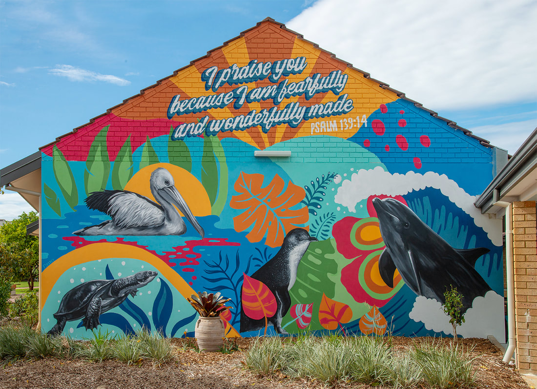
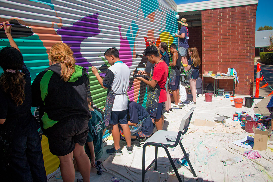
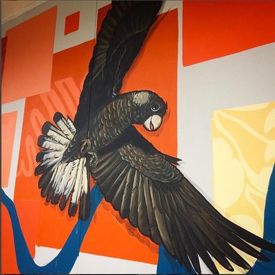
When: March 2023 Brief: South Coast Baptist College contacted me to paint a student-assisted mural at their school. The mural needed to incorporate their school colours and sports house animals as well as a verse. Outcome: I did an initial concept-building workshop with their Year 10 art students to brainstorm ideas for the mural. Taking their ideas, I incorporated them into a bold mural that celebrates their school colours and their four sporting houses. The students helped to paint the mural. 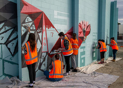 Client: Public Transport Authority, Right Track and the City of Kalamunda When: Sept 2021 Brief: Create a high quality, long-lasting artwork to cover a 2.6.m-high, 38m-long, curved section of wall on Ibis Place in High Wycombe, near the new High Wycombe train station. The segmented concrete block wall surrounds an electrical substation and will be seen by pedestrians, cyclists and vehicles accessing the station precinct. The design of the artwork will be guided by the themes the Youth Art Members identified in an initial planning workshop. Outcome: Artwork themes were identified by a group of young people from the Right Track program. The themes were: connection, Kalamunda, flora and fauna, in particular Black Cockatoos, Jacarandas and Kangaroos. Taking these themes on board Fieldey created a dynamic design the evokes the commuter rail journey from working in the city, which is filled with stark geometric shapes (left hand side of wall) which morphs into the organic forms and realistic animals of the hills (right). The animals represent the commuters on their journey home from work, morphing across the wall from geometric city animals into realistic animals. As the wall is curved, it must be walked around to be experienced and the artwork unfolds, like the landscape, as seen from a train. Part of the mural was painted as a community “paint-by-number” day by the participants of the Right Track program. A high-quality "making of" movie was also created by Fieldey and her team.
Client: City of Swan, Perth
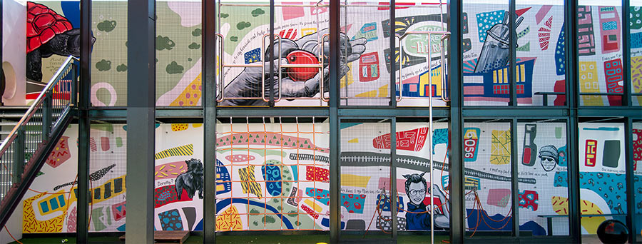
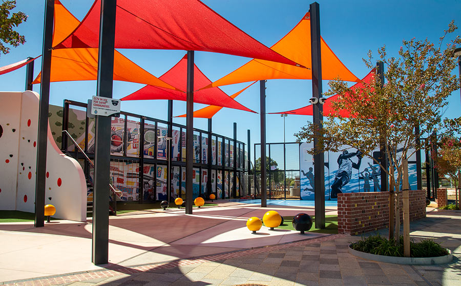
When: February 2021 Brief: The Weeip Park Community Art Mural is intended to increase community identity as well as to engage the youth of Midland as community stakeholders. The project aims to: create a vibrant landmark that will facilitate a sense of place and identity for the Weeip Park Youth Space. Meaningfully engage the local community in identifying key themes of place and belonging. To translate the results of the community engagement in to a professional mural image of high quality. To foster an energetic and creative atmosphere for the youth of Midland. To show, by example, to the young people of Midland, the significance of the creative arts in creating community and as a profession Outcome: Fieldey ran a total of five youth engagement brainstorming sessions and a workshop to gather ideas and stories for the mural from as broad a range of young people as possible. She also leaned on her experience as a YouTube creator and created a custom video to promote the project - speaking to young people on a platform that they use and identify with. A major theme of the artwork is connection: in the literal sense of Midland’s physical location as a transport hub, but also as a place where young people connect with each other. The colourful squares and shapes form a semi-realistic map of Midland, as seen from above, with places that are significant to the young people, such as schools and Midland Gate. These colourful squares and patterns were paintable by participants of all skill levels during the six community painting days Fieldey facilitated. Juxtaposed with this fun map are personal stories and memories that were painted as realistic black and white images, accompanied by text. These were been supplied by individual young people and form a story trail across the piece that visitors to the park can follow and read as they walk through the space. Client: Grilled to the Mac
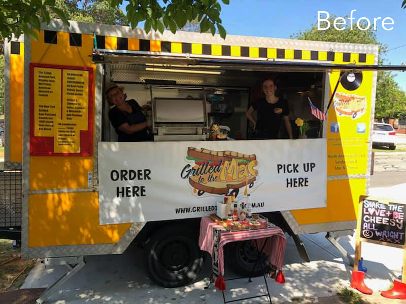
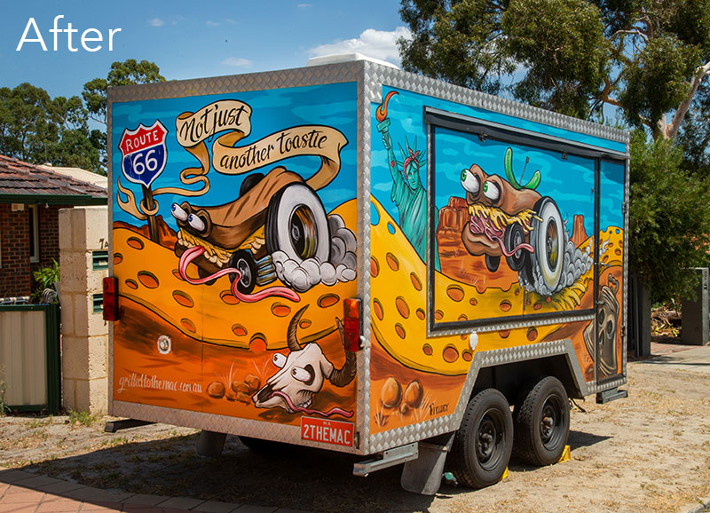
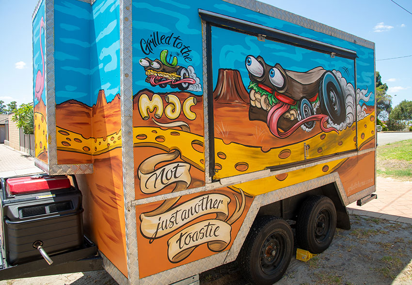
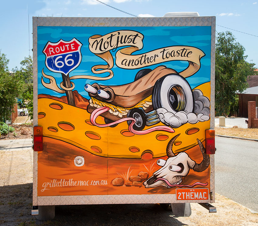
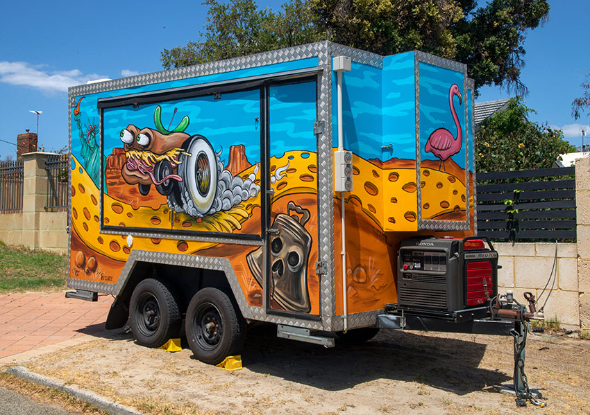
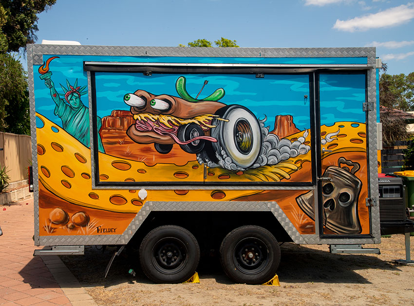
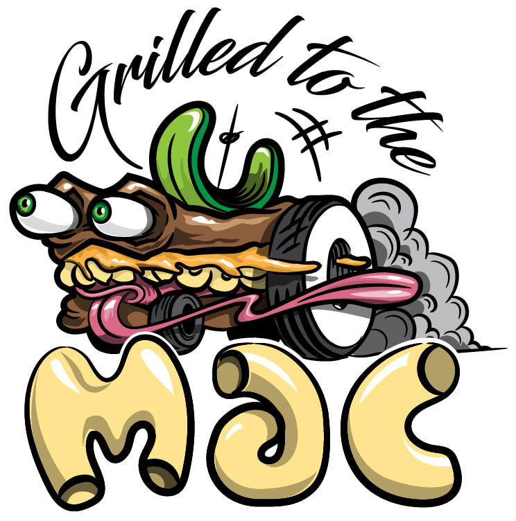
When: Feb 2020 Brief: Grilled to the Mac is a fixture on the Perth food-truck scene, however after 10 years of business the van was in need of a fresh paint job to draw attention to the business as it was getting lost amongst all the other food trucks at events. Kate, the owner of the truck, asked Fieldey to create something based on a dream she had: the logo (a sandwich with wheels) driving down a cheese road in a landscape that featured American icons that represented the types of food they have on offer. Outcome: Fieldey was immediately drawn to the idea of a hot-rod sandwich which took the original logo and made it stand out and better reflect the American fast food scene whilst also representing the "to the mac (max)" ethos of the business. The design for the truck incorporated Kate's idea of the cheese road and icons, but then pushed it a step further by combining American hot-rod custom culture and the iconic art of Ed Roth. Fieldey chose the high-impact complimentary colours of sky blue and orange to make the artwork pop, and created new dynamic and bold hot-rod sandwiches and icons. Kate then asked Fieldey to create a new logo for the business based on the new sandwich icon that better reflected the new look. Feedback from events has been fantastic, with the truck being busier than ever and receiving a lot of great feedback about the new look. Client: City of Stirling
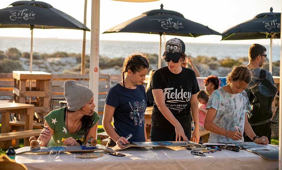
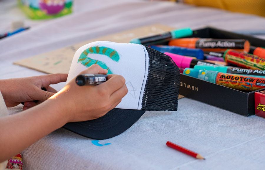
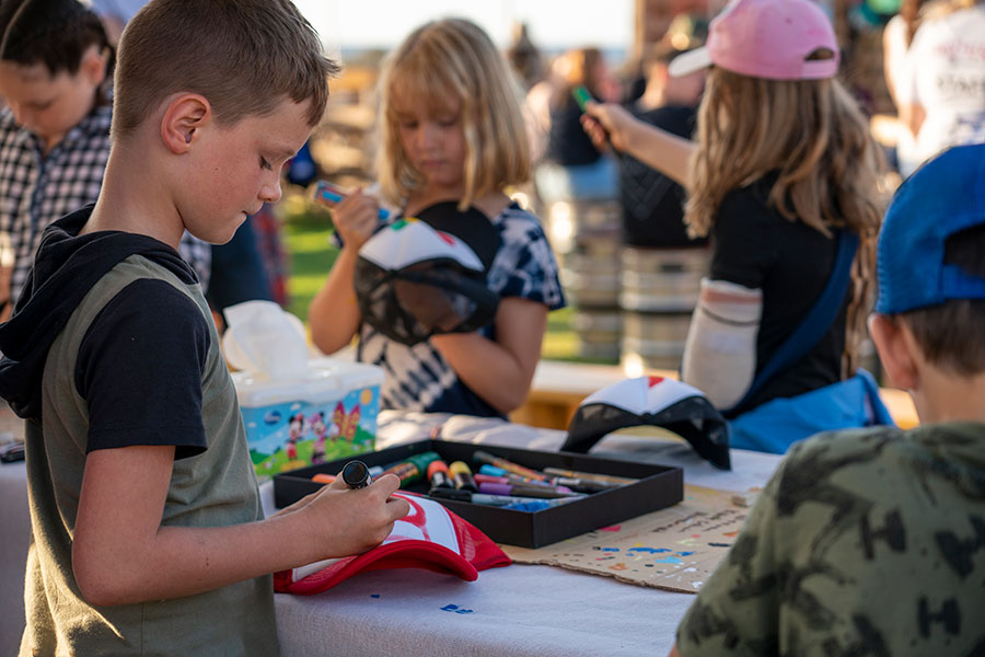
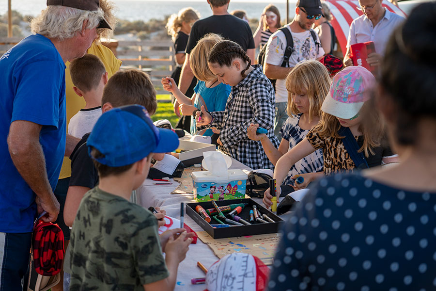
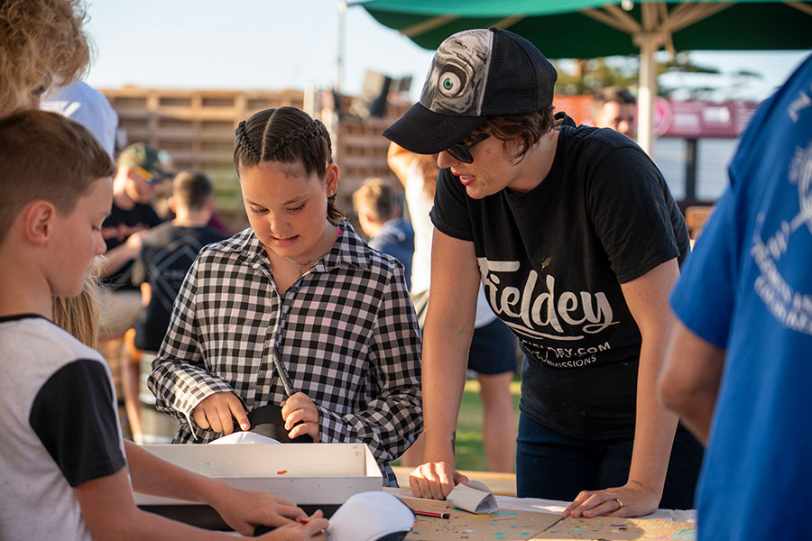
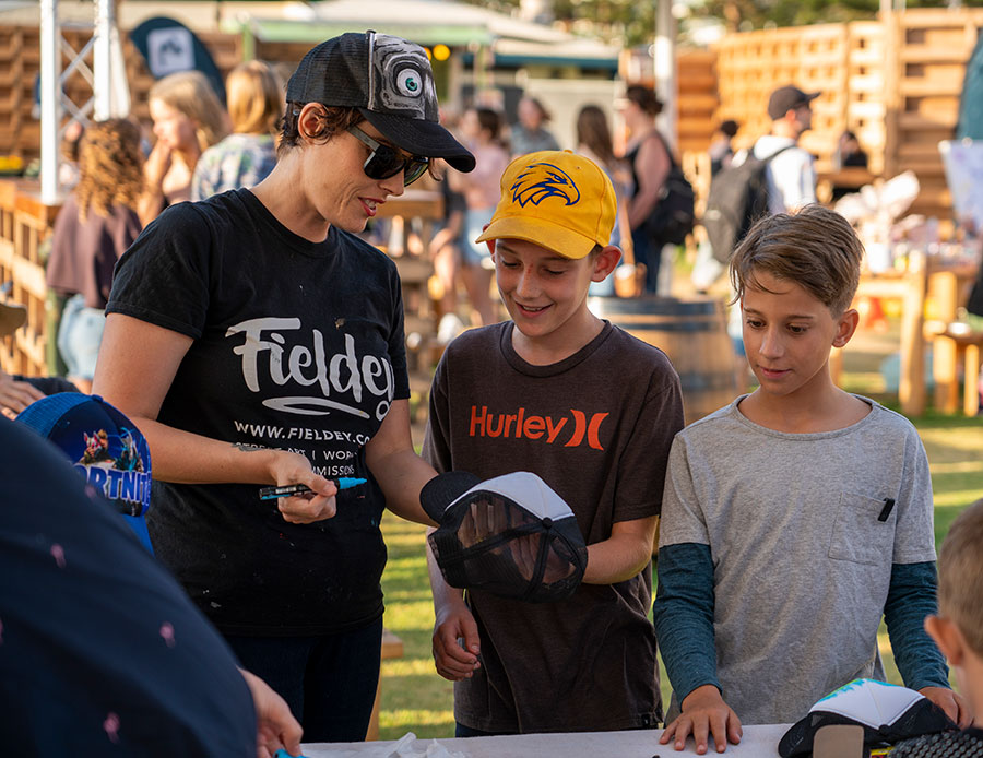
When: Feb 2019 & 2020 Brief: City of Stirling asked Fieldey to create custom 'drop-in' trucker painting workshops for their popular Sunset Veranda venue during Fringe World Festival. The idea was for it to add value to the beautiful beach-side venue and give kids and parents a fun, free experience. Outcome: Fieldey and her team facilitated multiple 3-hour 'drop-in' style free workshops. Participants ranged from small children, to the young-at-heart and everyone could choose from four different coloured trucker caps and we provided all the paint pens and pencils needed to create custom masterpieces that participants could wear with pride and take home afterward. There was also an option for participants to bring their own surfboards and skateboards to paint at the same time. The kids were thrilled to be able to create a custom piece of art that they could then wear to school and impress their friends. The looser 'drop-in' style of the workshop also allowed for it to reach more participants (up to 50 in two hours) and it meant that any age and attention-span could be accommodated.
Client: Safety Bay Senior High
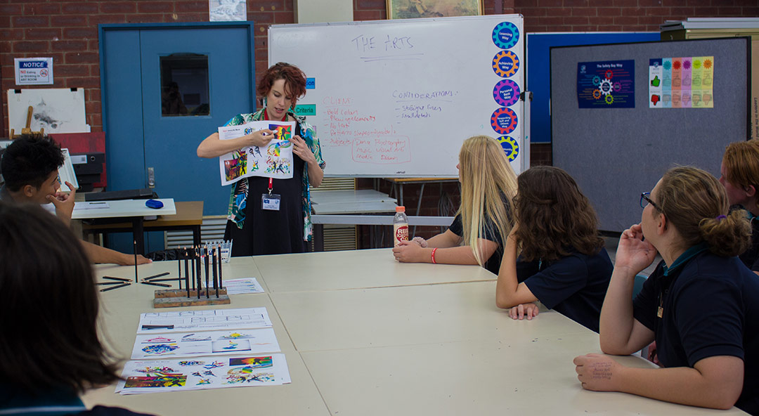
When: June 2018 and March 2019 Brief: Safety Bay Senior High School asked Fieldey to facilitate two student assisted murals across two years to help beautify the school and engage the students. The first mural in 2018, was created to coincide with the school’s 40th Anniversary and the second painted in 2019, was designed to promote ‘The Arts’. Outcome: Two large walls were picked for the murals and Fieldey worked with art teacher Tracey Sharpe, and two groups of selected year 8 to 10 students. The project started with an initial concept brainstorming workshop, where Fieldey worked with the students to come up with ideas for the mural concept. Utilising those ideas, Fieldey created a professional concept which was approved by the school. A second skills building workshop followed on, and Fieldey taught the students painting techniques to build their skills and confidence before a final full-day painting session where students painted the wall. Fieldey and Tracey finished the murals to a professional standard the day after. Client: Mellen Events
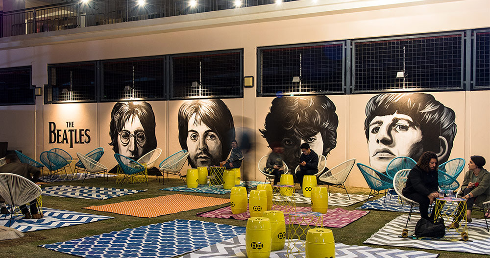
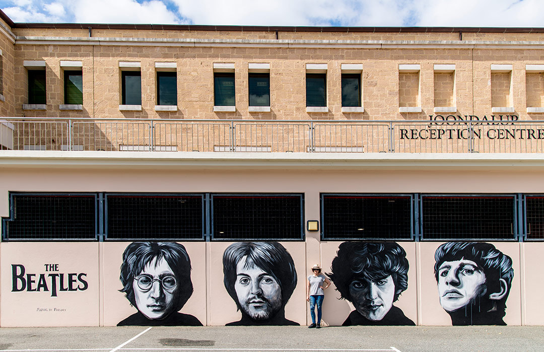
When: November 2018 Brief: Fieldey was commissioned by Drew from Mellen Events to create a large scale 'pop-up' mural celebrating The Beatles to be used in the Kaleidoscope Festival KBAR. Outcome: Fieldey painted The Fab Four over two days and the final mural was used as a backdrop for the pop-up 'KBAR' during the incredible Kaleidoscope Festival. The mural was a huge hit for fans of The Beatles.
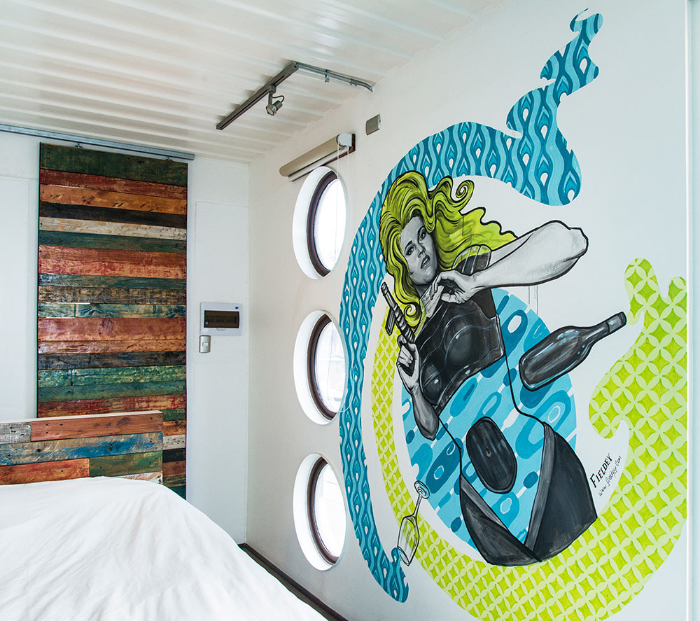
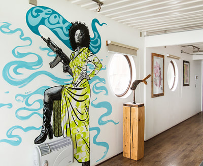
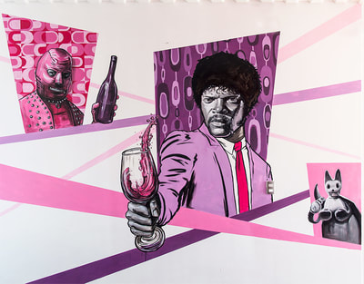
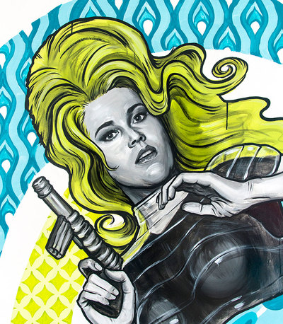
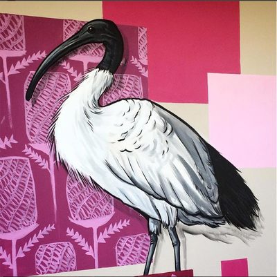
Client: Winebox Hotel, Valparaíso, Chile When: April 2018 Brief: Winebox is Chile's first hotel and winery made entirely from shipping containers. Fieldey was asked to create three custom murals in three different rooms that would combine a wine theme, with cult movies. Outcome: Fieldey and her partner Mitch Low, created three bespoke murals that combined the cult movies of Pulp Fiction, Barbarella and Foxy Brown with cheeky wine references. All the murals were painted in black and white with two bright accent colours that were colour matched with the dominant colour schemes in each room. Bright retro pop patterns also helped to bring together the retro theme and make the murals a part of the interior design of the spaces. The murals have been great for social media promotion, as delighted customers regularly post photos on instagram of them. Client: Stockland Bull Creek Shopping Centre When: November 2016 Brief: Fieldey was commissioned to be the chief facilitator and muralist for a collaborative project between Stockland Bull Creek Shopping Centre and Melville Senior High. The project was to produce a high-quality mural on a large 30m exterior wall of the shopping centre incorporating the skills of a Melville Senior High Year 11 design class. The mural theme needed to respond to the natural surrounds of the area and involve bright colouring and an eye-catching narrative. Outcome: The students, along with two art teachers, Ali Blackwell and Jenna Antoniolli, contributed to the patterning while Fieldey painted the realistic bird life and oversaw the entire project. Painting of the mural took three days in addition to an in-school ideas-building workshop with the year 11 students at Melville Senior High. The length of the wall is 30 by 2.5 metres and the theme explored the Nyoongar seasonal calendar and features local bird species such as the crow, galah and ibis. This project was a great example of how a shopping centre can integrate and involve the community while still receiving a professional-level finished mural.
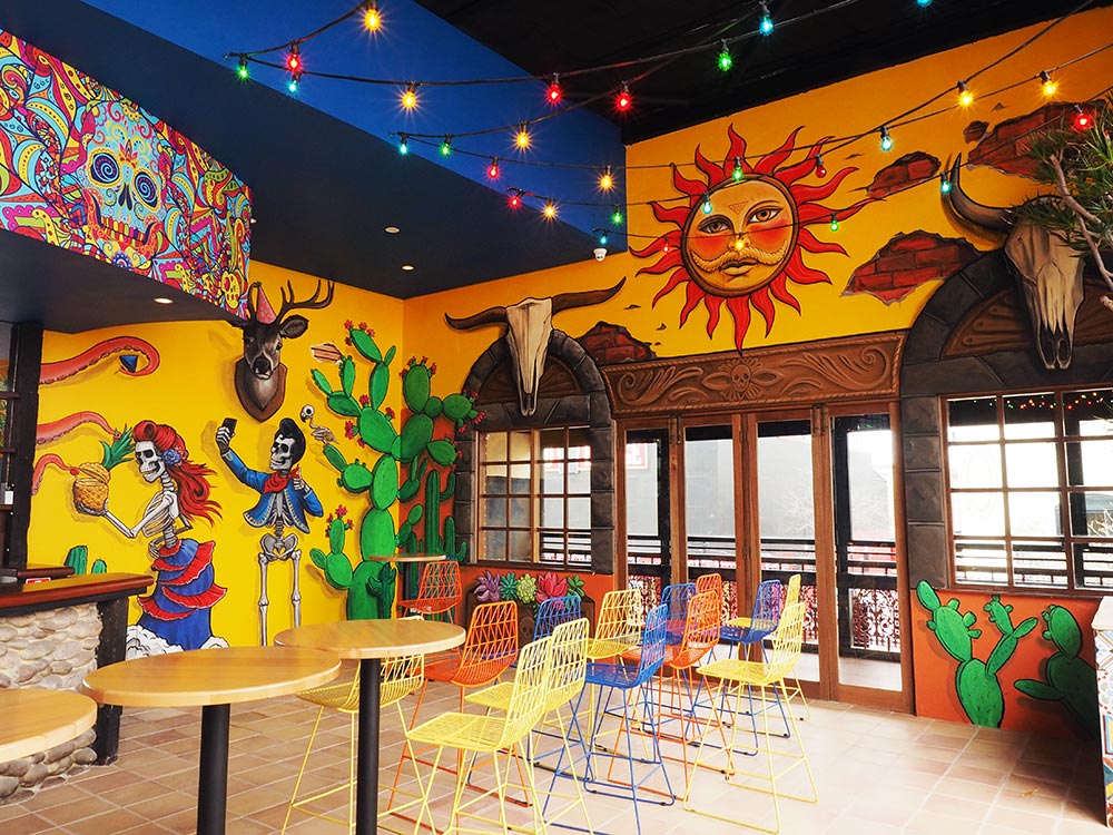
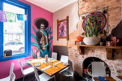
Outcome: Over the course of two weeks, Fieldey hand painted four massive interior walls during the re-fit construction phase. Large scaffolds were used and a tricky 7m x 5m staircase wall was fully painted with dancing skeletons. Colours and themes were inspired by, and responded to, the interior design. The final result was a suite of colourful and fun murals that worked in conjunction with the furnishings and interior design. Fieldey also created a fun "making of" video for Señor Peppers to use across their social media channels.
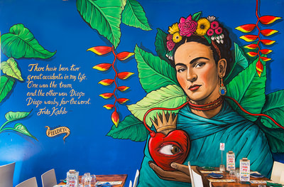
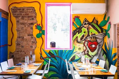
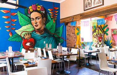
Outcome: Fieldey decided to fill the large three-section wall with a story about Frida Kahlo. Basing it on Frida's famous piece "Las Dos Fridas", she painted a large portrait of Frida in the main room. Frida is holding a heart that has a blood vessel that winds along the wall into the next room which features Diego Rivera, in toad form, holding an identical linked heart. The third wall features a mariachi skeleton holding a bottle of El Jimador Tequila. All the colours are based on traditional Mexican painting styles and the finished murals became iconic in Perth.
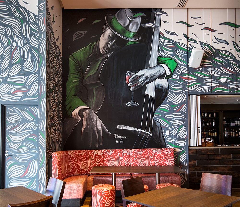
Outcome: Fieldey and Rob Jenkins were commissioned to bring the venue to life. Fieldey provided the human element and painted a large jazz-themed portrait on the rear wall, and Rob added his well-known leaf patterning to flow around the surfaces of the bar and interact with the mural. Both of the artworks used the Best Brew corporate colour palette of grey with touches of red and green.
Fieldey created two custom videos of the project for YouTube which can be viewed below.
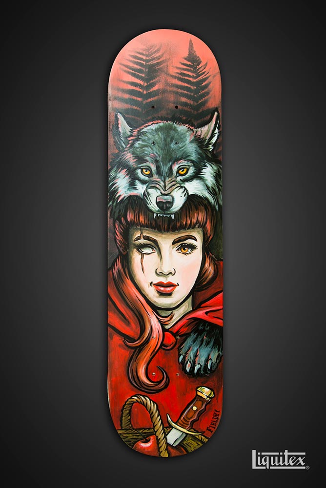
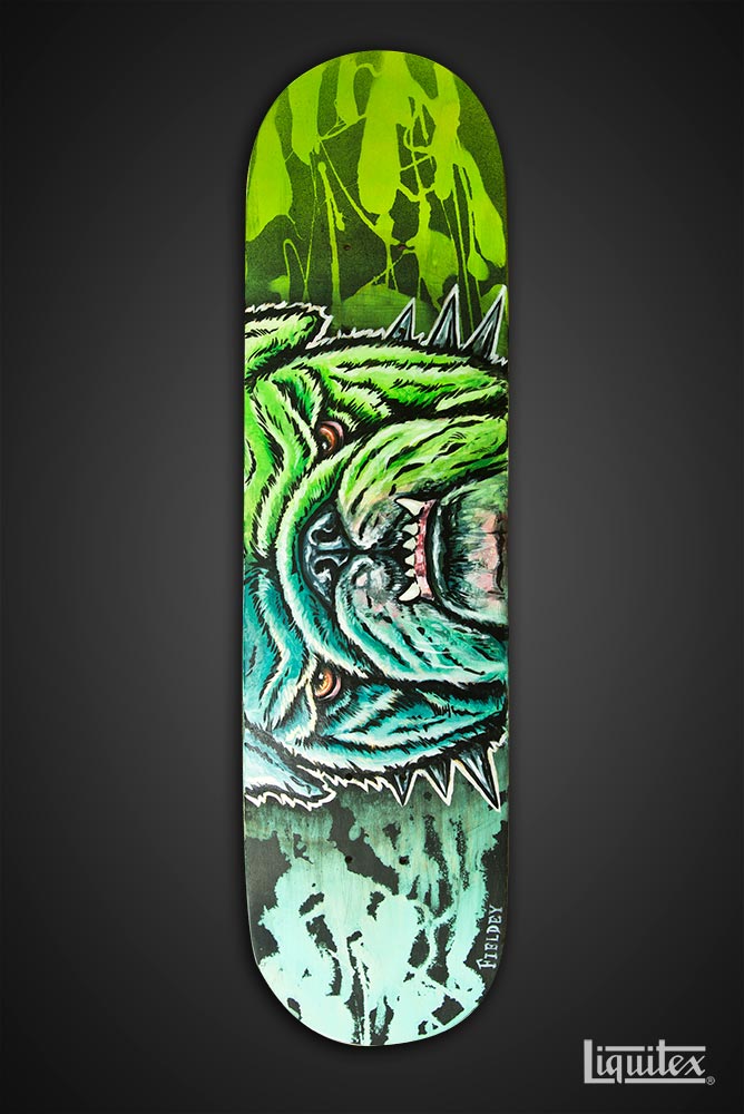
Outcome: Fieldey used many of her popular old-school spray inspired techniques to demonstrate the adaptability and range of the Liquitex Aerosol paints. These techniques included base-spraying the boards with a basic fade, a liquid soap technique and using chains as a stencil. Over the top of these backgrounds, Fieldey created three "story boards"; a Little Red Riding Hood inspired board, a crazy blue/green bulldog and a skulls and chains tattoo-inspired board. The aim was to show how well the different products (spray paints and acrylic paints) worked together. The boards enlivened the Liquitex booth display in at Oz Comic-Con in Melbourne, and the video which was played during the event, was further used across Liquitex Australia's social media channels.
Client: Anytime Fitness
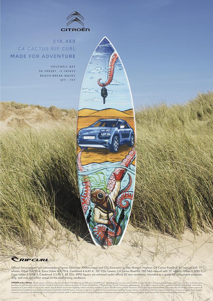
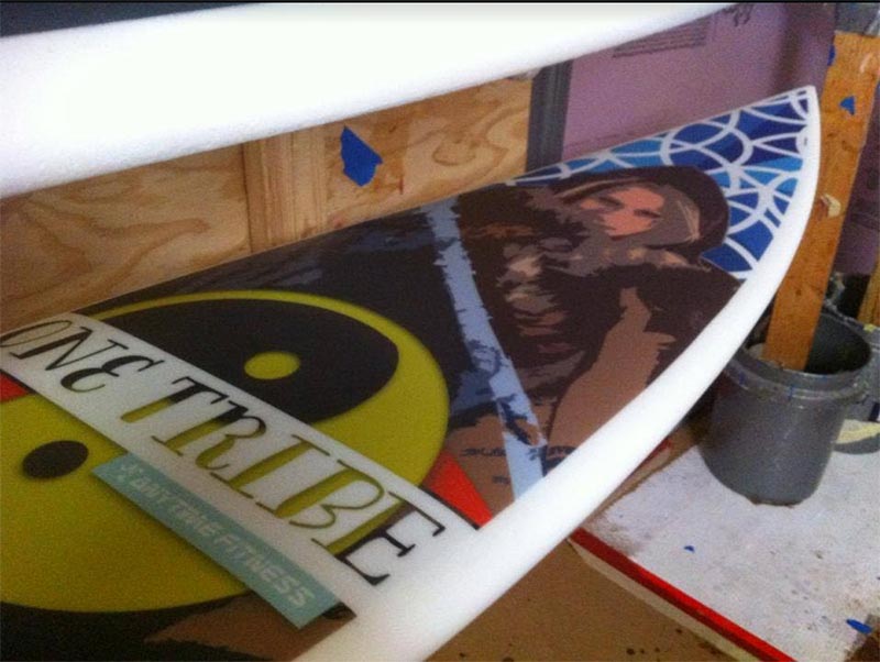
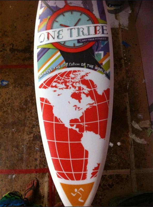
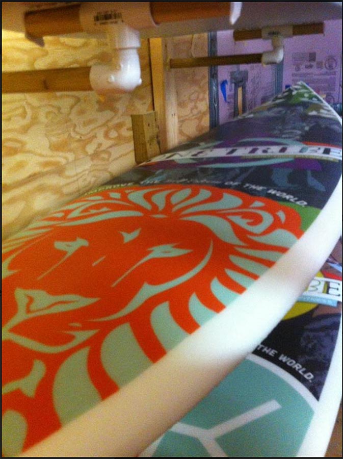
When: June 2013 Brief: The Anytime Fitness marketing manager asked Fieldey to organise five custom surfboards that were to be used as prizes at their 2013 annual conference in Minnesota. Their in-house graphics team were to create the designs for the surfboard inlays. Outcome: It quickly became apparent that the most cost-effective way to have the boards made was for them to be made in the US, close to the site of the conference. Fieldey found the only shaper in a neighbouring land-locked state and organised to have five surfboards custom shaped for the project. Fieldey then took the art graphics that were provided by the design team, and applied them to a digital surfboard template and had an Australian company print the artwork onto special surfboard mesh inlays. These inlays were sent to the US and applied to the surfboards during the manufacturing process. The resulting high-quality art boards were shipped to Minnesota in time for the annual conference. |
Categories
All
Archives
November 2023
|
